It has some good potential to be great, but right now there are many parts which are imo too simple.
What i really like are the 4 buttons (repair, sell...) with the interesting border glow effect. This effect should be done in a smaller scale around each build icon, the 4 up/down buttons, and the powerbar.
The logo in the radar looks good too.
I would like to see the whole sidemenu background a tad darker and more detailed. The diagonal and vertical gradients from blue to white look too simple. They are also too bright on some areas.
Some parts like the building icons and the power bar simply stand out too much. They should flow into the background like the 4 repair/sell/power/waypoint buttons.
It might help already if you give each part a 3d-effect via emboss/extrude. e.g. look at the radar logo and try to create these smooth blue/white border reflections on several other interface elements as well. _________________ SHP Artist of Twisted Insurrection: Nod buildings
It has some good potential to be great, but right now there are many parts which are imo too simple.
What i really like are the 4 buttons (repair, sell...) with the interesting border glow effect. This effect should be done in a smaller scale around each build icon, the 4 up/down buttons, and the powerbar.
The logo in the radar looks good too.
I would like to see the whole sidemenu background a tad darker and more detailed. The diagonal and vertical gradients from blue to white look too simple. They are also too bright on some areas.
Some parts like the building icons and the power bar simply stand out too much. They should flow into the background like the 4 repair/sell/power/waypoint buttons.
It might help already if you give each part a 3d-effect via emboss/extrude. e.g. look at the radar logo and try to create these smooth blue/white border reflections on several other interface elements as well.
Nice Tips there Lin Kuei Ominae I will adjust these things soon as it was just a start, I plan to create a CnC 3 or 4 style Side Bar for both sides.
Thanks to all you guys, your comments and critics really helped out much. thnx again. QUICK_EDIT
It's refreshing to see people trying new things. I know from (too much) experience how irritating sidebars can be to complete. The radar and buttons are fine, simple but nice, whereas the rest of the sidebar is far too plain; I'd also suggest trying something new with the power bar, in which I mean avoiding the simple horizontal red, yellow and green lines.
All in all, it's a great job for your first sidebar, but it still needs plenty of work. Some technical lines, circuit boards, holographic-like imagery and machinery would look really nice (I'm assuming you were going for a holographic look). QUICK_EDIT
Good work, but... GDI is not blue and doesn't have that logo, unless it's C&C3 and to be used in a C&C3-themed mod.
Heavens forbid we acknowledge C&C3! Grow up. VERY few sidebars exist for public or mod use, don't shit on it because it uses C&C3 assets. Find constructive things to discuss, not vent how much you hate C&C3. _________________ Victory! QUICK_EDIT
Interesting colour scheme, nice not to see brown and green for once (the TI sidebar still rocks though :p ). C&C3 was a cool game so it'd be nice to see an inspired GUI. Maybe add some more metalic parts though to give structure and leave the blue to the "energy HUD/visor" bits. QUICK_EDIT
Joined: 26 Feb 2010 Location: Inside my temple in Cairo.
Posted: Mon Nov 28, 2011 5:33 pm Post subject:
Very nice indeed!
Would you make one for NOD too please!!! _________________ If you are a member of the NSA and you are reading this, then you should know, that too much curiosity killed the cat!!!
Wenn Sie ein Mitarbeiter des BND sind und das hier lesen, sollten Sie wissen, dass zu viel Neugier der Katze Tod ist!!! QUICK_EDIT
My advice is to heavily reduce the bevel but the overall scheme looks better. Maybe make the metal a little more detailed (less repetitive) and dirtier and the power bar looks better when segmented too IMO. QUICK_EDIT
My advice is to heavily reduce the bevel but the overall scheme looks better. Maybe make the metal a little more detailed (less repetitive) and dirtier and the power bar looks better when segmented too IMO.
Will see that, I was thinking to reduce the bevel too. As I said its incomplete so lot of work is yet to be done on it. QUICK_EDIT
But there's something i don't find it fits well...I suppose it's that symbol in the lower part below the icons, and the powerbar looks kinda basic. =/ QUICK_EDIT
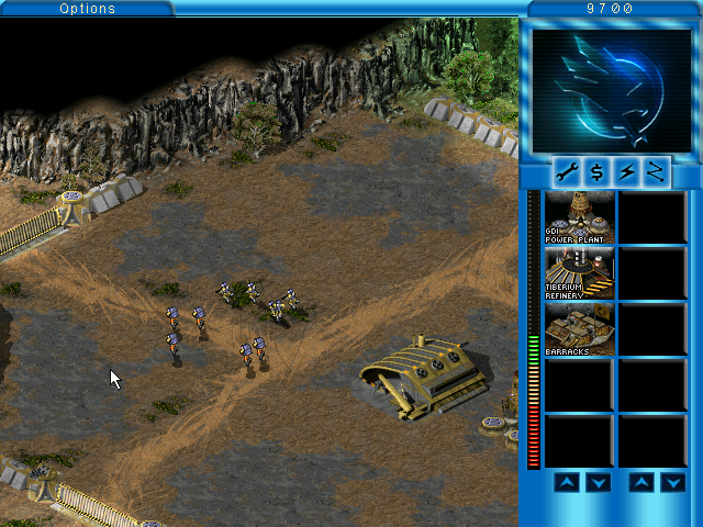
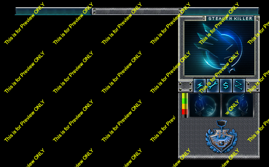
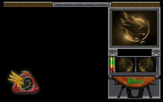
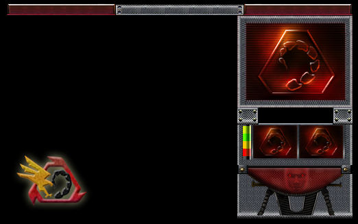
Preview of GDI and Nod sidebars, command buttons under the radar and the up down buttons under cameos are still under construction (You can tell as they are missing here LOL).
comments and suggestion are welcomed
Preview of GDI and Nod sidebars, command buttons under the radar and the up down buttons under cameos are still under construction (You can tell as they are missing here LOL).
comments and suggestion are welcomed
Now your work is starting to get interesting, looking really good me likes, would implement it into my mod. Really like the choice of colors and overall design. QUICK_EDIT
I'd get rid of the logos for missing cameos and the CABAL/EVA faces on the bottom, personally. The EVA sticks out a lot, and CABAL looks like a rapist. Other than that, ztyping sick. _________________ Victory! QUICK_EDIT
They look ok, just need to reduce the bevel a load IMO and make it look like actual metal if possible. But they're nice TDesque sidebars.
I will adjust these things when I get enough time, still working on these sidebars and these are not FiNAL, I will reduce the bevel a little and retouch it a little more.
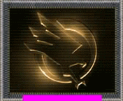
I created a Radar animation for GDI, Nod Radar is still under construction.
GDI Radar.gif
Description:
GDI Radar Animation - ITS LOW QUALiTY FILE HIGHRES WILL BE POSTED SOON
My only comment is the glow effect. It looks too much TBH. Maybe make them more to the grittier, rusty metal style? I meant the sidebar, not the radar anim. Can't say what's wrong with the radar anim, but could be better. _________________
Team Black wrote:
interesting seeing your voxel work. They're still better than Aro's!
My only comment is the glow effect. It looks too much TBH. Maybe make them more to the grittier, rusty metal style? I meant the sidebar, not the radar anim. Can't say what's wrong with the radar anim, but could be better.
Personally i'm thinking to start over again, gota new idea for the sidebar, i'll be back tomorrow QUICK_EDIT
As I'm highly interested into this, how's it going? That tomorrow never happened _________________ Free Tibed!
EA for worst company of the decade! QUICK_EDIT
You cannot post new topics in this forum You can reply to topics in this forum You cannot edit your posts in this forum You cannot delete your posts in this forum You cannot vote in polls in this forum You cannot attach files in this forum You can download files in this forum