Personally I prefer the official logo, unlike the one TW ended up with, if that had of stayed with its boxy 3 instead of the gay smooth one it would have been good. QUICK_EDIT
They should've used the original gold/silver style logo.
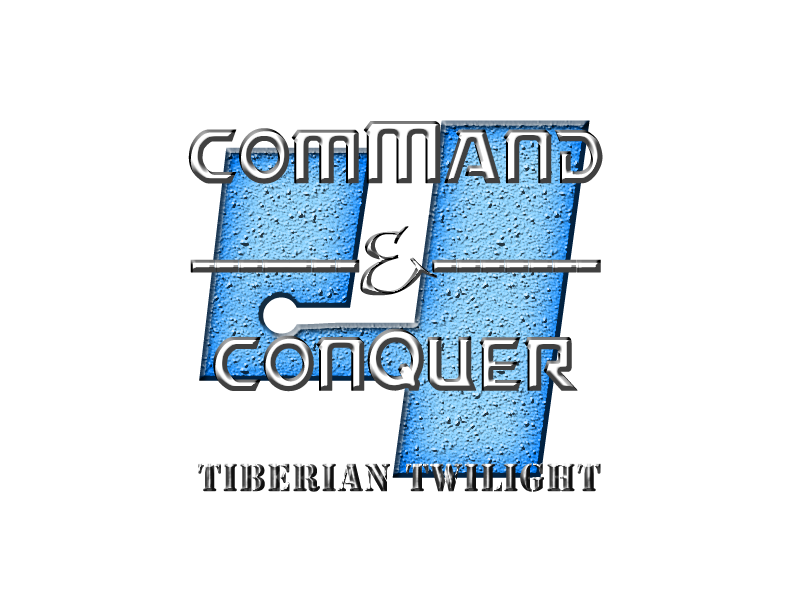
Regular bevels. Bad texture. The '4' needs a new typeface. I don't like the '&'. The text could use some tweaking with in characters window; meke everything line up. Like justified in MS Word. QUICK_EDIT
Joined: 02 Aug 2009 Location: A red zone, helping the Scrin. Posts:100000000
Posted: Fri Oct 02, 2009 9:37 am Post subject:
AltomareXD wrote:
They should've used the original gold/silver style logo.
Regular bevels. Bad texture. The '4' needs a new typeface. I don't like the '&'. The text could use some tweaking with in characters window; meke everything line up. Like justified in MS Word.
I knew someone would post like this, can't you people be more positive?
Altomare seems to have taken Deformat's role. _________________
Tutorials rock! QUICK_EDIT
Don't ever accuse that. AltomareXD is a talented graphic artist, he knows what he is talking about.
You on the other hand need to take constructive criticism and use it, instead of arguing. And I agree with what altomareXD said in full, the 4 is weird and the bevels and texture looks stock. QUICK_EDIT
Learn to take criticism good or bad, I understand there's a lot of unnecessary bad criticism going around lately, but there wasn't anything wrong with the criticism mentioned. Also pack it in with the Deformat jokes / bashing, you don't exactly help the situation.
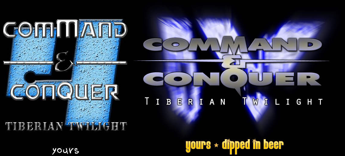
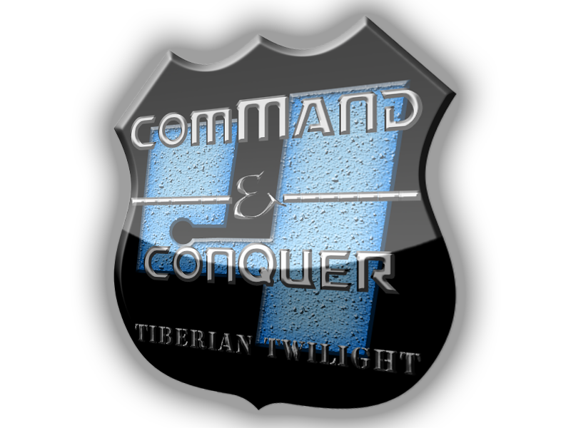
Also, I don't think the logos there look very CnCish, especially the badge one. I'd prefer a more classic CnC look to the new logos (yours and new CnC's). _________________ QUICK_EDIT
Joined: 02 Aug 2009 Location: A red zone, helping the Scrin. Posts:100000000
Posted: Fri Oct 02, 2009 12:29 pm Post subject:
I don't want to argue, I just want to say that you can say what you like about something, then criticize it, rather than overly criticizing it.
Ok, I agree that AltomareXD is better than Deformat.
MT wrote:
Don't ever accuse that.
It's assume.
Don't take this rudely, but why do I feel that whenever I post something like graphics or voxels, or just anything related to it, in any forum, someone says "This is bad, that is bad, even that." without suggesting something?
I believe AltomareXD could examine it and give me tips on how to improve it if I post the PSD.
Oh, about the 4, I don't like EA's 4, that's why I used the four from the font "PsiphoonBB".
I can't do any thing about the & however, as I can't find any fonts with the CNC-style &. Please suggest one for me.
AltomareXD wrote:
The head does not agree.
Lol XD
Sorry if I offended anyone.
BTW, I don't use spell check.
I understand what you mean by "this is bad, that is bad" and I encourage others to stop posting like that (not that there is much in this topic) and offer suggestions or more insightful opinions. I don't know where any CnC fonts are, though I'd be sure a few good quality ones would be floating around the net somewhere? _________________ QUICK_EDIT
- Needs a better and more consistent use of fonts (such as the "Tiberian Twilight" looks completely different).
- Don't use those "-"s, draw a line or something...
- WAY LESS BEVEL!one1
- Manky texture used on the 4...
I dont know... its just general design that's bad IMO. :/ QUICK_EDIT
Joined: 18 Feb 2005 Location: Star Kingdom of Manticore
Posted: Fri Oct 02, 2009 8:58 pm Post subject:
no no no NO!
Firstly, never EVER use that font again. EVER. whomever designed it did it horribly. plus it's TS font, not C&C font. use a square-ish font.
Secondly, Your bevels are **WAY** too strong. they're incredibly sharp and make me feel like they're violating me. NEVER use above 3px bevel on text. EVER.
thirdly, your textures are ghastly, at best. Choose something more... tiberian-ish. something that doesn't look like it's been carved out of a wall somewhere in mexico then painted blue.
Ratings:
Font Selection: 0/10
Color Scheme: 2/10
Textures: -48934/10
Bevel usage: -8234589/10
Other effects: 4/10
OVERALL RATING: -16567034/10 or 1/10
Take a look at CCHyper's logos. he's excellent at them, and you could learn from his work. _________________ "Reality is a lovely place, but I wouldn't want to live there." -Adam Young QUICK_EDIT
@Alto, why does the CNC logo on the image that says "yours dipped in beer" have a yellowish tint near the center of each letter? That makes the CNC logo look bad. _________________ Please, read the signature rules of the forum. QUICK_EDIT
You cannot post new topics in this forum You cannot reply to topics in this forum You cannot edit your posts in this forum You cannot delete your posts in this forum You cannot vote in polls in this forum You cannot attach files in this forum You can download files in this forum


![33922_cop[1]_Kane.png](https://www.ppmsite.com/forum/files/33922_cop1_kane_135.png)