Posted: Sun Jan 30, 2011 4:08 pm Post subject:
TS New Icons Project - TS/FS Nod Icons
Subject description: For those of you who don't like vanilla TS icons...
My goal is to remake all TS icons for everyone to download. I searched in PPM for a complete icon pack but I didn't find one, so that's why I'm doing this.
Modders, if you use any of these icons or all of them in any mod, I'd be very proud.
But I know they are not perfect, so if you find one that sucks please tell me but be constructive, telling me why. If you don't recognize one of them, just tell me, because it may be something wrong with it.
Now I'll do GDI, then I'm going to improve or replace the ones that need to.
Credits:
- Gangster for the Rocket Infantry, Engineer, Mobile Stealth Generator, Buggy and some of the backgrounds - http://www.ppmsite.com/forum/viewtopic.php?t=5593
- CnC Reborn - http://www.cncreborn.eu/
- TS Rising - http://www.moddb.com/mods/tiberian-sun-rising
- C&C3 The Forgotten for the veins in the Weed-Eater icon - http://theforgotten.cnclabs.com/
- Of course me too
Hope you like them!
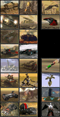
vehicles.PNG
Description:
Vehicles - Aircraft - Super weapons
Filesize:
52.82 KB
Viewed:
5222 Time(s)
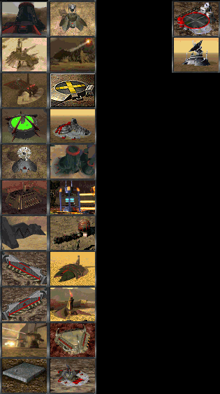
buildings.PNG
Description:
Buildings - 2 alternate building icons
Filesize:
68.31 KB
Viewed:
5222 Time(s)
infantry.PNG
Description:
Infantry
Filesize:
13.87 KB
Viewed:
5222 Time(s)
tsnodicons.zip
Description:
The icons: unpack both .MIX files in the TS folder to watch them instantly ingame
Why so many people watch this topic but no one download anything?
I can understand, some icons can be regular or even awful, but no one can deny that some of them are actually pretty good...
Again, for you who watch my icons, please leave some comments, to tell me what's wrong. I don't want comments about the whole pack because they don't help, so please, if you have time, be icon-specific. QUICK_EDIT
Also Known As: evanb90 Joined: 20 Feb 2005 Location: o kawaii koto
Posted: Mon Jan 31, 2011 2:19 am Post subject:
I suggest you get used to it. You're posting SHPs. They aren't high-quality building renders. It isn't a massive terrain pack. It isn't a totally new infantry unit.
This is not directed at you or the stuff you posted:
They're just cameos, the single most underrated aspect of both TS, RA2, Generals, TW and RA3 mods.
And you've packed them in mixes, so people might just be copying the image attachments into Paint and grabbing individual cameos, instead of having to the trouble of
-downloading the ZIP, extracting the MIXes, opening the mix files in XCC Mixer, extracting the files and then finding them wherever they got extracted. That doesn't sound too complicated, maybe it isn't to you (definitely isn't for me), but some (many?) of the people here lack the attention span to read more than a paragraph of information on a unit in a mod.
But for feedback the cameos:
Looking at them, you have a number of good quality cameos, like the Stealth Tank, the infantry, the gates and Power Plant.
There are also poor ones; to be more specific:
(GDI?) Radar Facility- The grayscale color of the building clashes terribly with the washed out desert-ish background.
SAM Site- It's hard to distinguish the shape of the launcher in the background, it could also be closer up.
War Factory- Color choice is very poor. You can't tell what direction the lighting is coming from, and the building looks like a single colored blob, and would be if not for the warning stripes on the door.
Silo- Full bright green != good idea. Rest of structure uses only ~2-3 grays
Laser Turret- You should make it have a close-up on just one of the turrets, not both.
Missile Silo- The missile silo is washed out compared to the background.
Weed Facility- The building is too small in relation to the overall cameo size.
A number of your cameos (for example Nod Artillery, the thing below the Limpet Drone, thing below the Tick Tank) could use more contrast to make the actual vehicles stand out more clearly.
Some of the source images you have here are good, but are used poorly. I suggest that if the palette conversion doesn't turn out right, edit the image. Change the colors. Make it fit the palette. _________________ YR modder/artist, DOOM mapper, aka evanb90
Project Lead Developer, New-Star Strike (2014-)
Former Project Lead DeveloperStar Strike (2005-2012), Z-Mod (2006-2007), RA1.5 (2008-2013), The Cold War (2006-2007) QUICK_EDIT
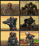
Personally I'd try to make a uniformed style, where most units face a similiar direction at the same scale with the same background so you can clearly see the unit. Here's a style we used for our mod as an example.
I actually like those TiberFCSL, not bad, not bad.
@Morpher. I like those too, except I dont like the red text. It blends in too much and makes it hardly readable. _________________
The enemy shall be injected with toxic poison - Venom QUICK_EDIT
@Morpher. I like those too, except I dont like the red text. It blends in too much and makes it hardly readable.
They look a lot better ingame - they're slightly below ingame size here, because PPM is a little weird with the [img] tags.
I agree with Morpher, though. A contiguous style all the way down the sidebar looks better than a bunch of entirely different sets of colours. Even RA2, which has its cameos showing units at a bunch of different angles, has a continuous color scheme (Greenish vehicles for the allies, light brown vehicles for the soviets). QUICK_EDIT
You cannot post new topics in this forum You can reply to topics in this forum You cannot edit your posts in this forum You cannot delete your posts in this forum You cannot vote in polls in this forum You cannot attach files in this forum You can download files in this forum