Posted: Sat May 20, 2006 6:31 pm Post subject:
The GDI Logo
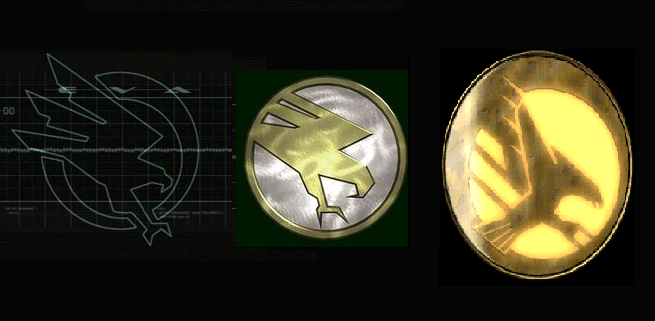
Subject description: if it's not the final, then this might not mater...
Take a look at this pic. I've been thinking for a while, that the new C&C3 GDI logo remainds more of the old TD GDI logo, rather than the TS one. Why is this so, if C&C3 is supposed to come after TS? why did they take example from the older logo? I can only wonder...
Granted, the CNC 3 GDI Logo does resemble a lot more to the TD logo than the TS one, it does still look reasonably good.
The thing with logos is, complex isn't always best. A simple, yet striking image/icon can be more effective than one made of lots of little bits.
As a logo design, I think its good. However, I do love the design of the TS one, and it is a shame that the CNC 3 doesn't seem to continue on from the evolutionary chain of logo design from TD to TS.
Its good, just it doesn't follow on from TS. _________________ If there is a problem on the forums, PM me. QUICK_EDIT
At least partially. I do like the TS one though, I'd prefer a logo which followed on from it. _________________ If there is a problem on the forums, PM me. QUICK_EDIT
Joined: 07 Mar 2006 Location: In ur BIOS, Steeln ur Megahurtz!
Posted: Mon May 22, 2006 2:26 pm Post subject:
the new logo is the best so far, the TD one comes in second. i dont like the TS one at all. same with NOD, though i (we) havent seen the new version yet _________________ Please, read the signature rules of the forum. QUICK_EDIT
You can post new topics in this forum You can reply to topics in this forum You cannot edit your posts in this forum You cannot delete your posts in this forum You cannot vote in polls in this forum You cannot attach files in this forum You can download files in this forum