Posted: Sun Jan 21, 2007 5:45 pm Post subject:
Nod Laser Lab
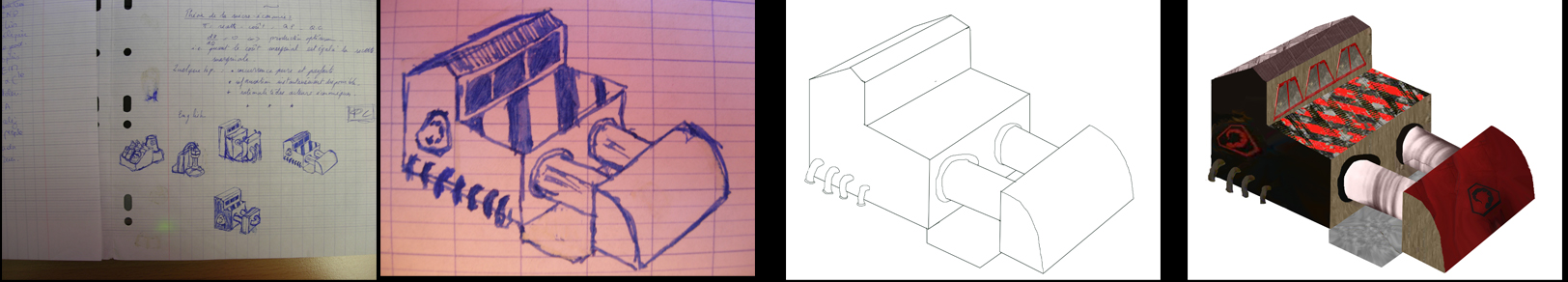
Here is my first nod building.
I know it is a bit of angle (like usual some would say) but it fits with my other buildings and above all this defect will vanish (at least diminish) when I'll resize it. (look at http://www.ppmsite.com/forum/viewtopic.php?highlight=academy&t=13316 ans you'll get what I mean).
That'll be an upgrade building that is necessary to enable all laser based weapons (I've add several very useful ones)
The texture on the wall bearing the red nod logo has been screwed up during the passage to shp builder; I'll certainly rework it.
tell me what you think.
well perspective aside.. it has texture issues. and the scheme should feel more Nod.
The concept is rather cool, but this design itself doesnt really feel like 'Laser Lab' or the mother of all obelisks..its blocky and the edges are too harsh.. and you can do without the pavement between the tubing.
I hope that helps. _________________ Delirium.. QUICK_EDIT
I'll check how it looks if I make the brownish wall grey (to make it more nod-like).
I seen many labs and there are some just two hundred meters near the place I sleep and they are blockish usually (I admit that as it's a game I could have made it a bit stranger). the "cube" part is the lab itself with scientist working in it and the tubes are guides for laser pulse so I plan to do an animation to show that (like a red glow inside the tube) and it might looks more like a laboratory.
Maybe you're right about the pavement, I'll remove it and see if it looks better. QUICK_EDIT
that's the way I made it. First pic is my notes from a finance lesson . Can anyone tell me the name of a good program to make texture ?? mine are "hand-crafted", maybe I could improve them with a good program
any image editing software will do. photoshop,gimp,Paintshop pro. and you can find free textures floating around...
It seemed to me you were using a 3d program, and I see some interesting thumbnails and method.
not totally wrong. its just application...notice the warping on the tubes. are going to make them transparent? The texture on roof is strange, unless it opens up or something that merits it to be painted like so .. and the sub-structure can be fully remappable? that small face is abit distracting
Also the building will have a particular light source, so shading will improve the look and add depth, to this since the contrast is soo high.. the icon is a bit skewed on the dark wall. I think one is enough.
the reason I pointed out the edges is because nothing comes a straight on 90 degree, everything flows into each other. smoothing those angles a bit would make it appear more "realistic". Yea, i seen labs. and not all of them appear as funky or strange as we think of them. most look like 'ordinary buildings' and not like oversized beakers,giant microscopes and exposed cryotubes" _________________ Delirium.. QUICK_EDIT
I use photoshop and bits from pictures from there and there. I thought t existed some texture-generator programs
I posted the methods just because I know people usually think I'm using a 3d program. (I get sometimes some remarks like "you should rotate that part" )
About the tubes I don't now exactly what I do but I was indeed thinking of transparency.
About the roof, it's not really notiable at ingame size (and in addition the final vuilding will be smaller)
All that is red will be remap.
The lethod I use condemn me to do the lighting and shades at last. However it often solve problem of "over-sharpness".
thanks for the constructive comments. I'll take advantage of it once I'll have time to work on my building QUICK_EDIT
The two white bars connecting the two things don't really fit the nod theme. It needs more stuff on it that would make it a "Laser Lab" _________________
I do like the method you've used, where you've at least concepted the design of the building first, and then worked from it, a nice method to see people working from.
I have to agree with what Akult has said so far, he's given some good advice.
A few other points:
Developing on the lighting - Lighting is an important issue, and for your buildings to look good, you need to consider it. From the dark face of the building on the bottom left side, it would appear as this is the opposite side of the light source.
... If you look, the light source for most things in TS actually have this completely the other way around.
This alone will really make your structure stand alone.
And as Akult has mentioned, your contrast (difference between light and dark areas) is very high, and is too much.
About the perspective.. You start off your design with a sketch.
May I suggest you start off with a grid to help you get the perspective right?
And finally.. the design.
Your designs although potentially nice, don't overly fit in too well with the other structures of TS.
Try first sketching a few TS structures, like the Power Plant or Radar, GDI if you want to design a GDI structure, and Nod if you want to design a Nod one..
Just look at what is already there, and use aspects and design features of those, to help make your designs flow better with the existing designs.
You have some good potential, so follow the tips, and you could be producing some brilliant work . _________________ If there is a problem on the forums, PM me. QUICK_EDIT
thanks for comenting.
I agree 'bout the lighting. But I'll bein to work on them only when I'll be satisfied by the overall form and the textures (that's the probleme of 2D drawing)
I know both the perspective and the style doesn't really fit with ts but it fit my other building. If I succed to better my method and make it qick enough, I'll remake all the buildigns. Anyway I think making it more grey and less brown can make it more nod-like.
(I know I should use a grid and it's the third building I make out of angle but I did them in a rush, impatient to see how it'l look ingame, out of a sketch made in class.) QUICK_EDIT
Try making it blend better with the other Nod structures by C&P the Nod symbol from the radar. You could work more on the textures too, so they fit better into the current style.
Yes you have gotten quite good, keep it up. But I would still say you change the colors or maybe change the textures of the white bars connecting. The red textures needs improvement and the whole structure lacks the "Nod" theme. _________________
why is one of the building's side completely dark while a nearby side that's facing the same direction as the one previously cited bright from the influence of light? it boggles the mind! If you fix that, it'll be tons better QUICK_EDIT
You cannot post new topics in this forum You cannot reply to topics in this forum You cannot edit your posts in this forum You cannot delete your posts in this forum You cannot vote in polls in this forum You cannot attach files in this forum You can download files in this forum