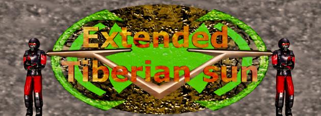
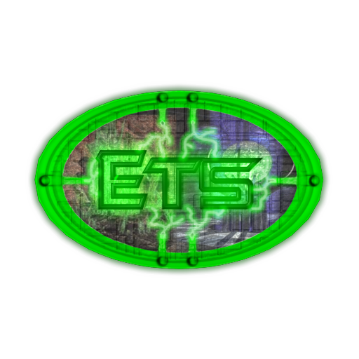
This is a concept I made up with: the yellow part is supposed to be GDI logo, and the Red part Nod logo. The green parts are the letters ETS. This is not the logo itself, just a concept.
Not bad, Gamemate...but I feel the background might need to be a bit darker, to fit in with the theme of Tiberian Sun.
An idea would be to just use the standard lettering of the TS logo and just add "Extended" to the top, giving it the blended effect...just an idea. _________________ QUICK_EDIT
Joined: 22 Aug 2006 Location: somewhere south of the north pole
Posted: Thu Feb 15, 2007 5:41 pm Post subject:
I'll post something if I find what I need
EDIT: I might be psykotick ill:
_________________ This is a signature Last edited by Dupl3xxx on Thu Feb 15, 2007 6:58 pm; edited 1 time in total QUICK_EDIT
=o I like gamemate's alot better. It seem if it were developed further it would be perfect..the design elements captured the tiberian sun feel the best, and kept that utilty feel to it.
although the backlight is a little too much atm.
maybe incorporating the elements from the installation menus [TD,TS] or something that gives it that theme of "a modder's workshop"
Dupl3xxx, yours is pretty good. I like how you incorporated the logos together, they came out very well, despite the Nod bias =P. Although the aesthetic kinda conflicts with the idea of ETS. your logo is rather intimidating, and the text doesn't seem to advertise the patch, more like something else. _________________ Delirium.. Last edited by Ickus on Thu Feb 15, 2007 9:28 pm; edited 1 time in total QUICK_EDIT
I'll see what i can do
BTW, thank god for imageshack
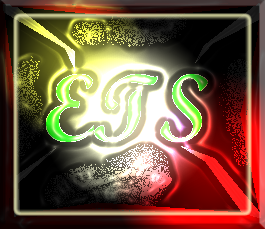
I think this one is the best so far
...it's just 2 GDI and 2 Nod logos mixed up though? It looks a bit naff to me. Maybe it's because I like logos to have meaning or be simple. QUICK_EDIT
Joined: 30 Jun 2006 Location: Oz, but near Melbourne, so its ok
Posted: Fri Feb 16, 2007 4:05 am Post subject:
Anyone here like the RP logo? Y'know, that YR icon with "RP" on it, so you can instantly identify it as some expansion to YR, something with the initials "RP" and something usable as an icon. Meaningful, simple, usable. Shrink any of these down and you get a mess. Glance at any and you won't know wtf they are.
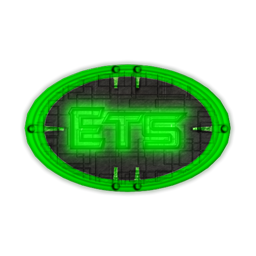
That said, the best is GM's, by far. _________________
MSN Status: (if says mobile, talk anyway) QUICK_EDIT
Anyone here like the RP logo? Y'know, that YR icon with "RP" on it, so you can instantly identify it as some expansion to YR, something with the initials "RP" and something usable as an icon. Meaningful, simple, usable. Shrink any of these down and you get a mess. Glance at any and you won't know wtf they are.
That said, the best is GM's, by far.
Fair point, but the objective in this thread is to design a 'Logo' not an 'Icon' _________________ QUICK_EDIT
Joined: 22 Aug 2006 Location: somewhere south of the north pole
Posted: Fri Feb 16, 2007 11:35 pm Post subject:
Red Dragon wrote:
What kind of layer styles? Color burn or something?
lets see: Overlay
Differense
Screen
Multiply
Burn
Dodge
and it might be some more. It was made wit some layer smashed together, and I did that again and again _________________ This is a signature QUICK_EDIT
Joined: 14 Feb 2006 Location: Flying into hostile territory
Posted: Sat Feb 17, 2007 2:29 am Post subject:
I'm going call that color style and lay out fire emerald and it makes kind of a poetic sense as VK is turning TS into the Jewel of EA handicapped games. _________________ QUICK_EDIT
Joined: 22 Aug 2006 Location: somewhere south of the north pole
Posted: Sat Feb 17, 2007 1:00 pm Post subject:
hehe, the last good WW game was YR.
They ripped of a lot, but it was better than nothing. If they killed generasl, and made TS 3 insed, killed that eivle dozer, perhaps we might got a good game _________________ This is a signature QUICK_EDIT
You cannot post new topics in this forum You cannot reply to topics in this forum You cannot edit your posts in this forum You cannot delete your posts in this forum You cannot vote in polls in this forum You cannot attach files in this forum You can download files in this forum


 (if says mobile, talk anyway)
