Project Perfect Mod Forums
:: Home :: Get Hosted :: PPM FAQ :: Forum FAQ :: Privacy Policy :: Search :: Memberlist :: Usergroups :: Register :: Profile :: Log in to check your private messages :: Log in ::


The time now is Fri Apr 19, 2024 3:53 am
All times are UTC + 0
C&C3: Tiberian Twilight mod Logo's
Moderators: Generals Moderators, Global Moderators, OpenRA Moderators, Red Alert 2 Moderators, Tiberian Sun Moderators
Post new topic   Reply to topic Page 1 of 1 [6 Posts] Mark the topic unread ::  View previous topic :: View next topic

Which logo do you prefer?
Gold, its shinny and pritty :)
16%
 16%  [ 1 ]
Tiberium, Its all over earth, so make it all over the logo too! :O
50%
 50%  [ 3 ]
Blue, a good balance, unique and good looking ;)
33%
 33%  [ 2 ]
Total Votes : 6

Author Message
Rico
Tiberian Beast


Joined: 01 Nov 2004
Location: Sydney, Australia

PostPosted: Sat Aug 04, 2007 6:51 pm    Post subject:  C&C3: Tiberian Twilight mod Logo's
Subject description: Vote for your fav
Reply with quote  Mark this post and the followings unread

I have 3 final logo's to choose from, i think all 3 are great and cant choose 1. The signifigence of each style is:
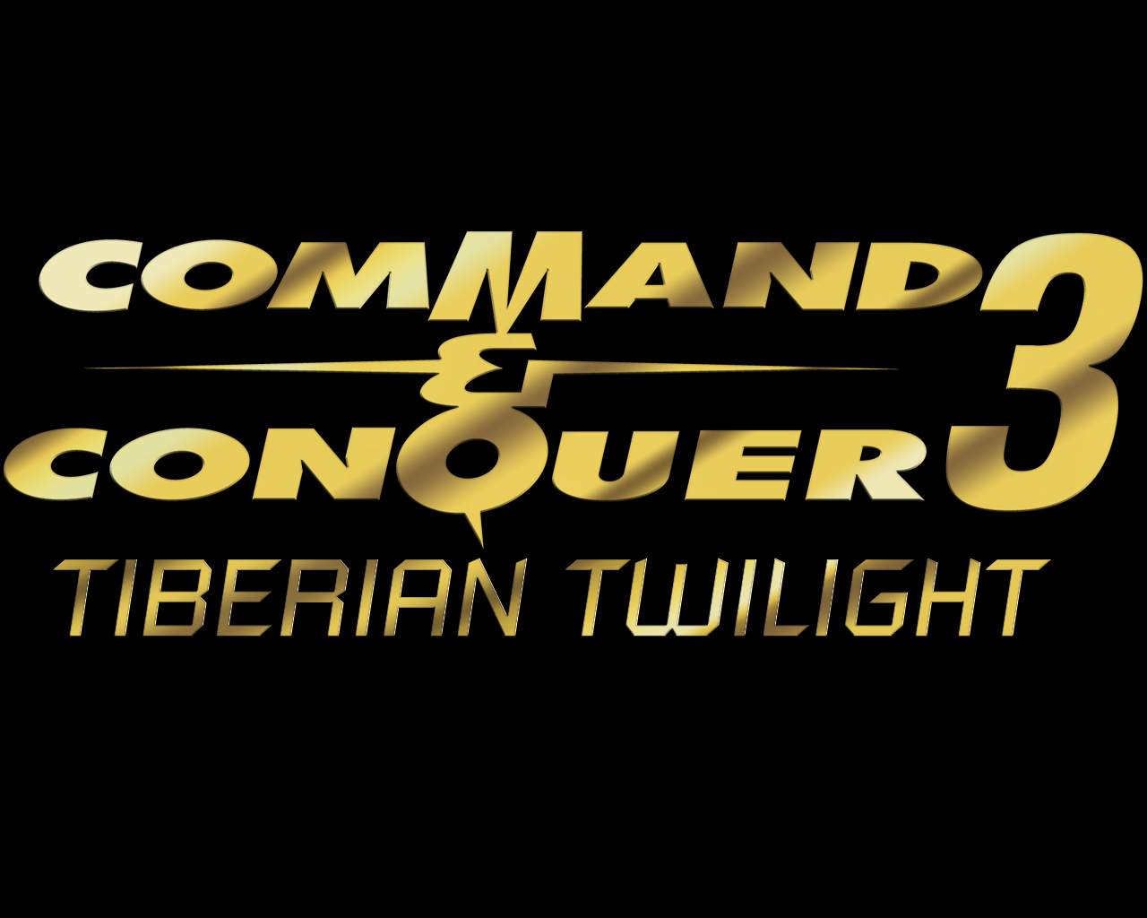
Gold - The TT logo that WW released was gold and didnt have the name on it, this is the first version of the logo i did and has the C&C feel to it.
Tiberium - Carno suggested i did a Tiberium version (so that it was different, like TS and RA1 was), after a few goes i ended up with this.
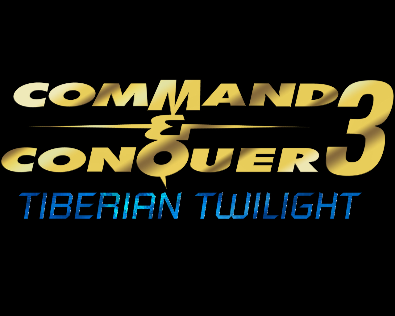
Blue - Trying to strike a balance I did a version that was unique but used an image from a TT concept art, the blue map image, i played around and ended up with this, which i am very pleased with Smile

CREDIT:
TSHyper for the C&C part, and for giving me some live tutorials #Tongue
so I wanna know what others prefer, so here they are:


C&C3 logoblack.jpg
 Description:
Gold, the origional and the best :)
 Filesize:  250.71 KB
 Viewed:  2463 Time(s)

C&C3 logoblack.jpg


C&C3blue2.jpg
 Description:
Blue Westwood Tiberian Incursion/Twilight style
 Filesize:  311.17 KB
 Viewed:  2463 Time(s)

C&C3blue2.jpg


C&C3tiberium7.jpg
 Description:
Tiberium Crystals
 Filesize:  324.91 KB
 Viewed:  2463 Time(s)

C&C3tiberium7.jpg


Last edited by Rico on Sun Aug 05, 2007 10:34 am; edited 1 time in total

Back to top
View user's profile Send private message Skype Account Yahoo Messenger Account
Team Black
Defense Minister


Joined: 25 Sep 2006
Location: Teamblackistan Posts: Over 9000

PostPosted: Sun Aug 05, 2007 4:58 am    Post subject: Reply with quote  Mark this post and the followings unread

Blue #Microwave

_________________
The Fall of Hammerfest - Epic Tiberian chain story

Tiberian Odyssey mapping department. Discord
The Team Black Index

Back to top
View user's profile Send private message
Crimsonum
Seth


Joined: 14 Jul 2005
Location: Fineland

PostPosted: Sun Aug 05, 2007 7:52 am    Post subject: Reply with quote  Mark this post and the followings unread

Actually, if you change the main theme, the Command & Conquer text to fit more with the green Tiberium, it would look neat. Smile

_________________


Back to top
View user's profile Send private message
soader
Rocket Infantry


Joined: 28 Sep 2005

PostPosted: Sun Aug 05, 2007 1:35 pm    Post subject: Reply with quote  Mark this post and the followings unread

i dunno its hard, between blue n green, but green takes the biscuit with the tiberium effect on the text ! go GREEN

_________________
Soader, Drum N Bass!!!!

Back to top
View user's profile Send private message Send e-mail Skype Account
Rico
Tiberian Beast


Joined: 01 Nov 2004
Location: Sydney, Australia

PostPosted: Sun Aug 05, 2007 3:36 pm    Post subject: Reply with quote  Mark this post and the followings unread

Personally i prefer the blue one, all images of TT concept had that sort of blue in them and it just seems to fit more, the green tiberium look just reminds me of EA's TW Sad

Back to top
View user's profile Send private message Skype Account Yahoo Messenger Account
Crimsonum
Seth


Joined: 14 Jul 2005
Location: Fineland

PostPosted: Sun Aug 05, 2007 5:46 pm    Post subject: Reply with quote  Mark this post and the followings unread

Maybe if you change the style, and make it bigger compared to the C&C label, blue would be good. It doesn't fit well right now because the C&C label is so huge and it's so small.

_________________


Back to top
View user's profile Send private message
Display posts from previous:   
Post new topic   Reply to topic Page 1 of 1 [6 Posts] Mark the topic unread ::  View previous topic :: View next topic
 
Share on TwitterShare on FacebookShare on Google+Share on DiggShare on RedditShare on PInterestShare on Del.icio.usShare on Stumble Upon
You cannot post new topics in this forum
You cannot reply to topics in this forum
You cannot edit your posts in this forum
You cannot delete your posts in this forum
You cannot vote in polls in this forum
You cannot attach files in this forum
You can download files in this forum


Powered by phpBB © phpBB Group

[ Time: 0.1603s ][ Queries: 18 (0.0134s) ][ Debug on ]