_________________ "we must do everything possible to do the Impossible Last edited by Chaotic General on Thu Oct 04, 2007 1:53 pm; edited 4 times in total QUICK_EDIT
It lacks a bit of detail. Since it's in Nod colors how about a Nod logo?
Also some remap places would be good.
Do you made the normals by hand? They could be better too. I only see 4 different directions of normals. Afaik the newest VSE has a good auto-normalizer tool. But this should explain one of the professional voxeler here. _________________ SHP Artist of Twisted Insurrection: Nod buildings
but some detail would be good, adding remap elements,..best to sketch it out before going into commitment that you might regret. ... _________________ Delirium.. QUICK_EDIT
Joined: 22 Aug 2006 Location: somewhere south of the north pole
Posted: Thu Oct 04, 2007 12:22 pm Post subject:
I like it, some<fine curves, but I think it's a bit simple in design.. An ok texture though. Also the voxel is atacked by the black dots of death! (fixable by "filling" the voxel)
And at last I like it very much, but I think it loks kinda half done
@ Ibram-Gaunt
Team colors are called "remap" _________________ This is a signature QUICK_EDIT
Hi, all
This models should be left with no logos, so they are not disadvantage if we want to use them for the other side ? _________________ "You got model "stolen", and yu'r reputation skyrockets..."
model's "stealing" company QUICK_EDIT
A lot better than the first attempt.
Amazing what some additional contrast will do..
May I suggest adding some range in the remap colours. All one shade never is a good thing.. _________________ If there is a problem on the forums, PM me. QUICK_EDIT
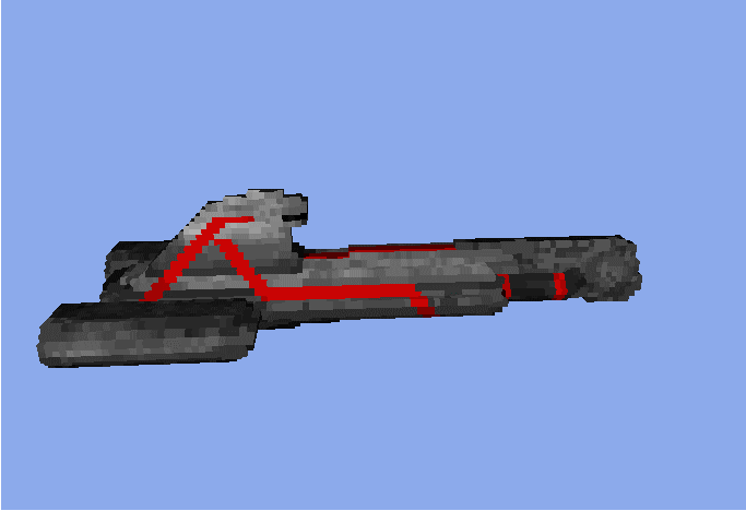
In your pic, the one on the left has little white dots...
And I don't really like the front, it's too flat.
But other than that, it's cool, i like the design. But I think it's more of a submarine type than a Battle Cruiser _________________ <a href="http://photobucket.com" target="_blank"><img src="http://i150.photobucket.com/albums/s101/ordo-058/done.png" border="0" alt="Photo Sharing and Video Hosting at Photobucket"></a> QUICK_EDIT
oh i dunno... maybe that its fits in with the pre-exisiting tiberian sun voxels? _________________ Please, read the signature rules of the forum. QUICK_EDIT
Joined: 22 Aug 2006 Location: somewhere south of the north pole
Posted: Sat Oct 06, 2007 12:29 pm Post subject:
I see work, good work! And I don't think the frony is bad, but make it a "seperate" peace. And make the remap somewhat darker. Never abov "26" is a good rule And now, it looks much more "evil" >] _________________ This is a signature QUICK_EDIT
Joined: 25 Sep 2006 Location: Teamblackistan Posts: Over 9000
Posted: Sat Oct 06, 2007 1:49 pm Post subject:
Well that's not bad - I'd give the remap some shading though as well, it doesn't blend well with the rest of the model _________________ The Fall of Hammerfest - Epic Tiberian chain story
Tiberian Odyssey mapping department. Discord The Team Black Index QUICK_EDIT
You cannot post new topics in this forum You can reply to topics in this forum You cannot edit your posts in this forum You cannot delete your posts in this forum You cannot vote in polls in this forum You cannot attach files in this forum You can download files in this forum