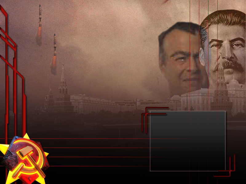
Missiles and Romonov really do not fit... Needs to blend in with the art style of the background more to look better. Also the two missiles are exactly the same with exaclty the same exhaust flames. _________________ QUICK_EDIT
Also, you might want to move Stalin a bit so that it does not look as if the Kremlin tower is sticking up his nose... _________________ Adapt or die QUICK_EDIT
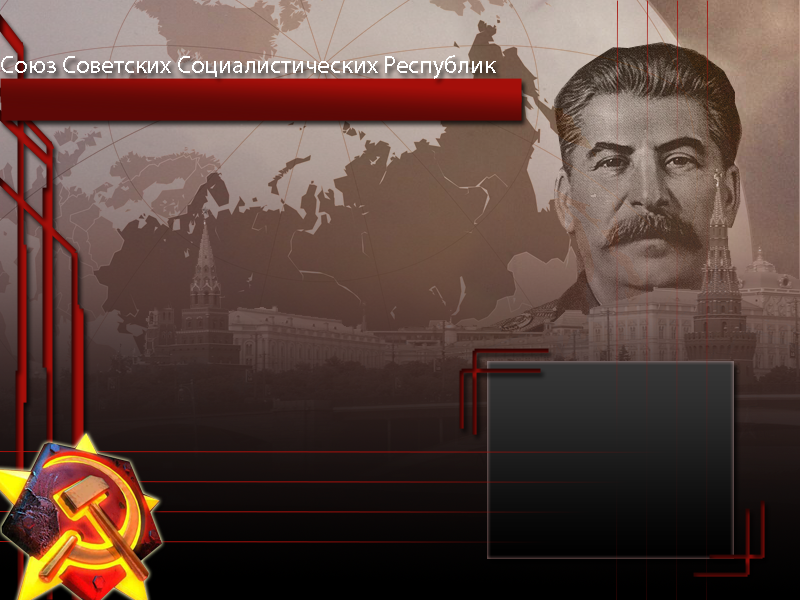
That's much better, though the outer glow color around the soviet logo and the Satin / Inner shadow effects on the red bars to the left ruin it in my opinion. You also need to do some cleaning up around Stalin's head, at the moment it has corners. QUICK_EDIT
It looks like ass. You rely too much on blending effects and they all conflict.
The drop shadows look horrible. If you're going to use drop shadows, center them or lower the opacity.
Stalin's head is jagged. The red has too much gradient, it makes it stick out too much from the flat image behind it. _________________ PreRA2 Dev Lead QUICK_EDIT
Hey, it's looking better. It still needs some work, however.
Some things I'd like to raise points about:
First off Stalin's head is a little bit low on opacity. The lines being visible from behind look odd. Additionally, like BrianPrime said, his whole silhouette is a bit jagged and unnatural looking. Try making the cut out more curved and form fitting.
The Russian text above your red gradient box looks pixelated.
The Soviet symbol in the bottom left has too much contrast and is far brighter from the rest. Perhaps tone down the saturation values and maybe do a tiny hue variance. Or, remake your own Soviet logo.
The inner shadows (I think) on those red corner parts looks odd. (The red corners around the box that says "satellite images")
I don't mind that whole gradient rectangle, however, I can see at the far left edge it cuts off and I can see background pixels. Fix that up.
Keep experimenting with the shapes. The one's on the left don't exactly look like they belong. Keep exploring and trying though.
Aside from that, it is looking better from the original. Though those background images look like you just searched them on google and put them back there. Try making your own map and such. Original and self-made work is always best.
Also, in regards to what Deformat said about the globe in the background. I think its opacity is fine it adds some nice contor lines.
BrianPrime, shadows do not always need to be centered/lower opacity if different direction. I don't think I ever center shadows. Lowering the opacity signifies that the light source is weaker and not causing as much intensity. Additionally, if you change the feather/spread it is changing how sharp the shadows are. Thus, showing the steepness of the angle of light cast and intensity. It's good to play with shadows and it is vital to know how you want them being cast in your final image.
Deformat wrote:
Also,it might help us out to find out some more issues if you'd post the PSD maybe.
I see no point in doing that. You can see the final image he is trying to convey when he updates with a newly edited pic. It's his work, let him fix his issues himself.
I hope I helped. _________________ Please, read the signature rules of the forum. QUICK_EDIT
I'd remove the Russian text, or at least put Sat Images in Russian if you know the word for it. Its strange to have two separate languages -especially- if the player is supposed to be the Soviet commander imo.
I suggests ditching the Soviet symbol from RA2 entirely and using the Red Star or something to make it look more 'official'. Its beautiful though. Keep it up. _________________ Victory! QUICK_EDIT
Joined: 23 Apr 2010 Location: indonesia, sticking at keyboard
Posted: Thu Jun 24, 2010 1:47 am Post subject:
Joshy wrote:
Hey, it's looking better. It still needs some work, however.
Some things I'd like to raise points about:
First off Stalin's head is a little bit low on opacity. The lines being visible from behind look odd. Additionally, like BrianPrime said, his whole silhouette is a bit jagged and unnatural looking. Try making the cut out more curved and form fitting.
The Russian text above your red gradient box looks pixelated.
The Soviet symbol in the bottom left has too much contrast and is far brighter from the rest. Perhaps tone down the saturation values and maybe do a tiny hue variance. Or, remake your own Soviet logo.
The inner shadows (I think) on those red corner parts looks odd. (The red corners around the box that says "satellite images")
I don't mind that whole gradient rectangle, however, I can see at the far left edge it cuts off and I can see background pixels. Fix that up.
Keep experimenting with the shapes. The one's on the left don't exactly look like they belong. Keep exploring and trying though.
Aside from that, it is looking better from the original. Though those background images look like you just searched them on google and put them back there. Try making your own map and such. Original and self-made work is always best.
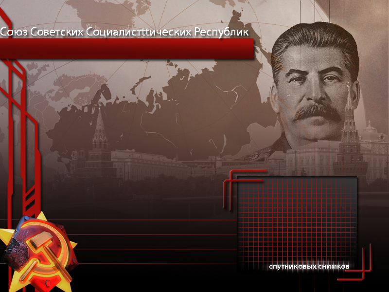
thanks! but if you mean take the pic self, i will if i live in moscow
1. fix'd, i hope
2. now it's better or not?
3. fix'd, i hope
4. how to make it better? i remove the inner shadow and change it with bevel
5. Fix'd
6. yes i new in photoshop. is that better now?
Also, in regards to what Deformat said about the globe in the background. I think its opacity is fine it adds some nice contor lines.
Somehow it still looks a bit annoying.Maybe he shouldn't make its opacity lower,maybe he could make its opacity smaller,duplicate the layer and set it to "overlay".I'm thinking that it might work somehow,yet I might be wrong.
Joshy wrote:
Deformat wrote:
Also,it might help us out to find out some more issues if you'd post the PSD maybe.
I see no point in doing that. You can see the final image he is trying to convey when he updates with a newly edited pic. It's his work, let him fix his issues himself.
Maybe you're right.
Also,agree on all points mentioned.
@iamn00b:
2.Its still pixelated.I still think it should be removed,since in YR there's that country name box.
4.I still see inner shadow
6.Ever experimentated with Free Transform?... QUICK_EDIT
Joined: 23 Apr 2010 Location: indonesia, sticking at keyboard
Posted: Thu Jun 24, 2010 1:50 pm Post subject:
Deformat wrote:
@iamn00b:
2.Its still pixelated.I still think it should be removed,since in YR there's that country name box.
4.I still see inner shadow
6.Ever experimentated with Free Transform?...
2. No, there isn't. it's a special unit/power name box
4. again, no, there isn't. What you see is bevel+gradient overlay (angle)
6. For what? rotating? resizing? how to make it better? QUICK_EDIT
Hey, it's looking better. It still needs some work, however.
Some things I'd like to raise points about:
First off Stalin's head is a little bit low on opacity. The lines being visible from behind look odd. Additionally, like BrianPrime said, his whole silhouette is a bit jagged and unnatural looking. Try making the cut out more curved and form fitting.
The Russian text above your red gradient box looks pixelated.
The Soviet symbol in the bottom left has too much contrast and is far brighter from the rest. Perhaps tone down the saturation values and maybe do a tiny hue variance. Or, remake your own Soviet logo.
The inner shadows (I think) on those red corner parts looks odd. (The red corners around the box that says "satellite images")
I don't mind that whole gradient rectangle, however, I can see at the far left edge it cuts off and I can see background pixels. Fix that up.
Keep experimenting with the shapes. The one's on the left don't exactly look like they belong. Keep exploring and trying though.
Aside from that, it is looking better from the original. Though those background images look like you just searched them on google and put them back there. Try making your own map and such. Original and self-made work is always best.
Also, in regards to what Deformat said about the globe in the background. I think its opacity is fine it adds some nice contor lines.
BrianPrime, shadows do not always need to be centered/lower opacity if different direction. I don't think I ever center shadows. Lowering the opacity signifies that the light source is weaker and not causing as much intensity. Additionally, if you change the feather/spread it is changing how sharp the shadows are. Thus, showing the steepness of the angle of light cast and intensity. It's good to play with shadows and it is vital to know how you want them being cast in your final image.
Deformat wrote:
Also,it might help us out to find out some more issues if you'd post the PSD maybe.
I see no point in doing that. You can see the final image he is trying to convey when he updates with a newly edited pic. It's his work, let him fix his issues himself.
I hope I helped.
The reason I say always use centered shadows is because beginner photoshop users probably don't know how to make it look decent if they don't. Centering them is a failsafe way to make it look nice. And besides - remember that on a monitor everything is flat. So the best 3D effects are where you're looking right on it - shadows right underneath. Otherwise it creates kind of a mental confusion from the flat front-facing monitor and the sideways shadows, and causes it to look really bad. The same is NOT true in PRINTED media which will not always be viewed dead-on. QUICK_EDIT
Convert to a 8 bit gif with a palette.
Use xcc mixer to make a palette out of the image.
Put the palette into the shp palette folder and import the image then choose the pal file you added during import.
Watch your image turn to crap to finish. QUICK_EDIT
Convert your image to indexed colors,256,then save it as a PNG file,no interlace,and use XCC mixer/VK's PNGtoSHP tool/SHP Builder/some other tool around here.
Also Known As: ZivDero Joined: 23 Jul 2013 Location: Russia
Posted: Sun Aug 25, 2013 9:00 pm Post subject:
iamn00b wrote:
Joshy wrote:
Hey, it's looking better. It still needs some work, however.
Some things I'd like to raise points about:
First off Stalin's head is a little bit low on opacity. The lines being visible from behind look odd. Additionally, like BrianPrime said, his whole silhouette is a bit jagged and unnatural looking. Try making the cut out more curved and form fitting.
The Russian text above your red gradient box looks pixelated.
The Soviet symbol in the bottom left has too much contrast and is far brighter from the rest. Perhaps tone down the saturation values and maybe do a tiny hue variance. Or, remake your own Soviet logo.
The inner shadows (I think) on those red corner parts looks odd. (The red corners around the box that says "satellite images")
I don't mind that whole gradient rectangle, however, I can see at the far left edge it cuts off and I can see background pixels. Fix that up.
Keep experimenting with the shapes. The one's on the left don't exactly look like they belong. Keep exploring and trying though.
Aside from that, it is looking better from the original. Though those background images look like you just searched them on google and put them back there. Try making your own map and such. Original and self-made work is always best.
thanks! but if you mean take the pic self, i will if i live in moscow
1. fix'd, i hope
2. now it's better or not?
3. fix'd, i hope
4. how to make it better? i remove the inner shadow and change it with bevel
5. Fix'd
6. yes i new in photoshop. is that better now?
So, how 'bout now?
Errr..... As one of Russian men I can tell you that "Спутниковых снимков" is not correct. I would be correct, If you said something like Not enough Satellite Images, so the right one is "Спутниковый снимок" and would even better if you put "Снимок со спутника" (Image from satellite) because it sounds better in Russian. I you try to use other people's language, better ask someonet who uses it every day than Google Translate. _________________
DarkVen9109 wrote:
What in the name of insanity is this? I FRICKING LOVE THIS LOGICCCC!!!!!!!!!!!!OOOOOOOOHEEAWWWWWWWWWWWYAAAAAAAAAAAAAAAAAWWWWWW PEW PEW PEW PEW BOOM BOOM BOOM!! Nice I love this!!!! Ferriswheel bomb, Dive bomb. New Logic discovered thanks to Kenosis
You cannot post new topics in this forum You cannot reply to topics in this forum You cannot edit your posts in this forum You cannot delete your posts in this forum You cannot vote in polls in this forum You cannot attach files in this forum You can download files in this forum