If you are talking about the concrete, that's Westwood's game engine doing it's favorite job, not rendering the few bottom pixels of the SHP. It does it to practically every SHP in the game. Nothing any of us can fix, far as I know.
A corrected ZShapePointMove should fix this (i.e lower to cover the missing pixels).
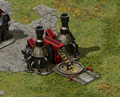
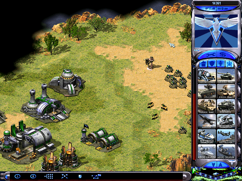
Oh and I'm really liking the Con Yard ingame and updated Soviet sidebar, just noticed those details whilst re-looking through old prerelease material.
I don't mind the text on the new Corkscrew cameo though I think the slight tint change has removed some of the contrast especially on the back part of the vehicle. QUICK_EDIT
If you are talking about the concrete, that's Westwood's game engine doing it's favorite job, not rendering the few bottom pixels of the SHP. It does it to practically every SHP in the game. Nothing any of us can fix, far as I know.
A corrected ZShapePointMove should fix this (i.e lower to cover the missing pixels).
Well, It's in the exact same position as Westwood's SHP so I don't know. _________________ Oh. QUICK_EDIT
If you are talking about the concrete, that's Westwood's game engine doing it's favorite job, not rendering the few bottom pixels of the SHP. It does it to practically every SHP in the game. Nothing any of us can fix, far as I know.
A corrected ZShapePointMove should fix this (i.e lower to cover the missing pixels).
Oh and I'm really liking the Con Yard ingame and updated Soviet sidebar, just noticed those details whilst re-looking through old prerelease material.
I don't mind the text on the new Corkscrew cameo though I think the slight tint change has removed some of the contrast especially on the back part of the vehicle.
How do you edit the ZShapePointMove? _________________ PreRA2 Dev Lead QUICK_EDIT
Well, It's in the exact same position as Westwood's SHP so I don't know.
It's widely believed that Westwood didn't know what they were doing most of the time.
Symphonic wrote:
How do you edit the ZShapePointMove?
Basically ZShapePointMove accepts X & Y values in pixels. As far as I can tell a higher value means either further left for X or lower down for Y. Negative values are further right for X or increase the height for Y.
I think it's a centre point around which the game renders the SHP. Take a look at the NAREFN here.
This is the original vanilla RA2/YR Refinery with ZShapePointMove=30,15. Notice there the bottom gets a little messy.
Here's the Refinery now with a value I just guessed, but it has appeared to fix the issue. New value is ZShapePointMove=30,25 (30 is X, 25 is Y).
Now here's a stupid value inputted, ZShapePointMove=500,500. Notice the SHP hasn't rendered at all (at least not within the canvas of the SHP, so nothing has appeared ingame).
This is all my guess-work but the proof is in the pudding. QUICK_EDIT
Well now I think it works a bit different from what I said in the above post but the logic is kinda the same. If the value is done wrong then it can cause the base SHP to overlap animations with lower (or higher, they're negative numbers) ZAdjust values. I assume the ZShapePointMove tag is to fix any instances where the terrain overlaps the SHP.
But this is the wrong topic. Simply - the problem can be fixed. QUICK_EDIT
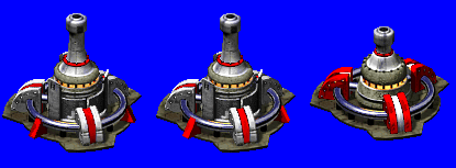
I added more depth and made the lighting exactly like Westwood's, Thanks man, but the point of this is he hates it and refuses to use my remap in his mod, I'm not expecting that to change (Me being able to use it) we will probably have to just go with the not so good remap. (more opinions are welcomed) _________________ Oh. Last edited by Dasfonia on Wed Jun 08, 2011 1:53 am; edited 1 time in total QUICK_EDIT
You know that you can open it up in Paint set the secondary color to the background blue, then set to transparent selection. Once done you paste the new one directly on top of the old one then undo and redo to compare. It's like a makeshift gif. _________________ Oh. QUICK_EDIT
Okie-dokie left one it is, maybe I forgot to originally post a version in color, and I also just made this a version showing all the changes and why they were made. So mine is basically facts that prove it is better and equal to Westwood standards.
Hmm seems a waste to throw array some structure art because one person disagrees.
Maybe some upload some "scrapbook/junkyard" zip of files when done.
Oh yeah I forgot to reply to you well anyways, Brian does not just disagree with it he hates, absolutely despises, thinks it garbage. _________________ Oh. QUICK_EDIT
facts that prove it is better and equal to Westwood standards
LOL!
I wrote that incorrectly and ment to say "facts that prove it is better than Brian's and equal to Westwood standards". I figured meh, they'll understand. _________________ Oh. QUICK_EDIT
facts that prove it is better and equal to Westwood standards
LOL!
I wrote that incorrectly and ment to say "facts that prove it is better than Brian's and equal to Westwood standards". But I figured meh, they'll understand. _________________ Oh. QUICK_EDIT
I wrote that incorrectly and ment to say "facts that prove it is better than Brian's and equal to Westwood standards". I figured meh, they'll understand.
Uhm, I knew what you meant and it's still a stupid sentence. Considering it's entirety opinion based you can't "prove" it's better than anything. QUICK_EDIT
I wrote that incorrectly and ment to say "facts that prove it is better than Brian's and equal to Westwood standards". I figured meh, they'll understand.
Uhm, I knew what you meant and it's still a stupid sentence. Considering it's entirety opinion based you can't "prove" it's better than anything.
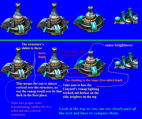
Well it is a fact that I made the shadows correct on the right triangle. I have the Allied Construction Yard's right there to prove that.
The shading on the curve is the the same as the retail remap you want to know how that is a fact, because I used the eye dropper tool in SHP Builder and selected those same colors that are on the retail remap, and I based the shading off of the retail middle remap curves and metal curve part. Also basing off of the shadow position of main structure the lighting affecting the right triangle's sunny-side up would NEVER be that dark, it is physically impossible. (Read Yellow Text)
The basic shadow lighting-color of the left triangle I got off the color of the retail remap of the right remap curve on the retail Ore Purifier.
I got the correct color of the shadow from the pipe on the right triangle by selecting the color on the retail remap on the Ore Purifier's shadow from the pipe that is one the middle curve. (Read Red Text)
I made the left triangles shadow side blend better with the sunny-side up by adding pixels that would match Westwood's color-shading transitions. (Read Purple Text and look at it up close in paint and reference to other building's remap)
I actually added depth to the middle curve remap based 100% off of the retail middle metal curve piece. (Read Orange Text)
Westwood is the source of the facts and I have made it exactly like their remap which was done on a 3d model and is impossible to be incorrect seeing that they had real 3d environmental lighting. As I said I am correct and it is about the facts, simple as that. And yes this actually is how much thought I put into doing remap. _________________ Oh. QUICK_EDIT
Both of them are fine TBH. I'm quite sure nobody is going to squint just to look at the remaps while they're playing.
Yeah, but you know I just have to have everthing perfect. So you see what I'm saying even if your not going to look at it all the time in my mind I still know it does not look too great.
Hogo wrote:
Your good I admit that, but your so very full of yourself. Brians remap was just fine.
I never said it wasn't just fine. I am starting to see why you can like it, but I just have trouble seeing past the fact that it does not match up with Westwood's quality. As you see I am a perfectionist. _________________ Oh. QUICK_EDIT
The shading on the curve is the the same as the retail remap
Why is that a good thing OR necessary exactly?
Dasfonia wrote:
the lighting affecting the right triangle's sunny-side up would NEVER be that dark, it is physically impossible
Ever thought it might just be the texture? The metal doesn't have a consistent brightness level, otherwise it would look plain and dull. The darkened area could simply be tarnished material. Considering the building probably contains vats of molten metals I expect it to be a dirty industrial structure.
Also theoretically there could be a cloud perfectly in position to cause the area to be darkened, so yes, it is "physically" possible.
Dasfonia wrote:
remap which was done on a 3d model and is impossible to be incorrect seeing that they had real 3d environmental lighting
Well Westwood could have easily have adjusted the lighting per structure or even accidentally use the wrong lighting settings, such as if they decided to change the angle during development. They've made many, many continuity errors regarding ingame graphics in the past so I wouldn't expect anything better from them. QUICK_EDIT
The shading on the curve is the the same as the retail remap
Why is that a good thing OR necessary exactly?
Because it's accurate and makes it look better. And plus it looks great in the first place.
Dasfonia wrote:
the lighting affecting the right triangle's sunny-side up would NEVER be that dark, it is physically impossible
Ever thought it might just be the texture? The metal doesn't have a consistent brightness level, otherwise it would look plain and dull. The darkened area could simply be tarnished material. Considering the building probably contains vats of molten metals I expect it to be a dirty industrial structure.
Why would it be dirty in that ONE place? and plus the only time Westwood ever used that dark of remap is used is for single shading pixels (such as the depth I used in the middle curve remap) OR damage frames, NEVER-EVER like that, and if there was a cloud the not only the remap would be dark. _________________ Oh. QUICK_EDIT
Dasfonia, get your shit together and stop embarking on pointless projects that only serve to slow the mod down.
I hate the work you did. It looks like shit. Scrap it. I want the SHP finished the way I intended. If you can't do that without having this stupid, immature debate on the forum, get off my mod team. I don't understand why it's so hard to STOP THINKING YOU RUN MY MOD. _________________ PreRA2 Dev Lead QUICK_EDIT
Dasfonia, get your shit together and stop embarking on pointless projects that only serve to slow the mod down.
I hate the work you did. It looks like shit. Scrap it. I want the SHP finished the way I intended. If you can't do that without having this stupid, immature debate on the forum, get off my mod team. I don't understand why it's so hard to STOP THINKING YOU RUN MY MOD.
Teehee get on AIM then.
At any rate I guess this ends the discussion folks, back with more updates on things soon, most likely ingame screenies. _________________ Oh. QUICK_EDIT
Left, because the middle one has lesser shades of team color. It looks plastic and dull.
Erm... okay then complain about Westwood's original remap then, because that's the style I replicated.
I'll quote someone on these forums; "It's almost fact that Westwood didn't know shit of what they were doing at least half of the time". Look at how TS first looked and played and how it ended up. They had mercenaries you could hire from armories, a dynamic Tiberium life cycle that would evolve with game time, disruption effects and such, and even a unit that could scavenge dead units (Nod Scavenger). The mutant hijacker was actually a much more complex and unique Nod unit.
Or how about how they cancelled C&C3/Incursion, and Continuum to work on YR, E:BFD and EnB?
Or even how they made all Nod troops look exaggerated in Renegade to detach the players from realism?
Westwood made some poor choices; Doesn't mean we have to follow suit. QUICK_EDIT
They had mercenaries you could hire from armories, a dynamic Tiberium life cycle that would evolve with game time, disruption effects and such, and even a unit that could scavenge dead units (Nod Scavenger). The mutant hijacker was actually a much more complex and unique Nod unit.
Or how about how they cancelled C&C3/Incursion, and Continuum to work on YR, E:BFD and EnB?
Or even how they made all Nod troops look exaggerated in Renegade to detach the players from realism?
Westwood made some poor choices; Doesn't mean we have to follow suit.
I am done with the discussion. Sorry. _________________ Oh. QUICK_EDIT
Joined: 01 Feb 2007 Location: Las Vegas, Nevada, USA
Posted: Sat Jun 11, 2011 6:28 pm Post subject:
I do not see how half a page is worth begging an imaginary mod to come split the topic. If you really badly want a mod, I would suggest maybe pm one. People be busy now a days, including ppm's mods. QUICK_EDIT
I do not see how half a page is worth begging an imaginary mod to come split the topic. If you really badly want a mod, I would suggest maybe pm one. People be busy now a days, including ppm's mods.
Speaking of shit that should be split... *le cough* _________________ Discord: princess_marisa
Steam QUICK_EDIT
Joined: 01 Feb 2007 Location: Las Vegas, Nevada, USA
Posted: Sat Jun 11, 2011 7:45 pm Post subject:
FurryQueen wrote:
wardeathfun wrote:
I do not see how half a page is worth begging an imaginary mod to come split the topic. If you really badly want a mod, I would suggest maybe pm one. People be busy now a days, including ppm's mods.
Speaking of shit that should be split... *le cough*
Here's something I've been working on for the past 4ish days on and off. It's the new completely custom made Aegis Cruiser cameo. A very accurate recreation of the beta cameo, I pasted the original beta cameo in next to it. Also ignore the screwed up part of the side bar.
Fun Fact: The Aegis Cruiser's voxel has no bottom face, you can see inside of it.
Well if that's the original to the left then it really isn't very accurate IMO. The new Aegis is at the wrong angle for a start and uses the wrong colours. Why not just try improve the original? It is pretty messy but I'm sure you could something with it. QUICK_EDIT
Well if that's the original to the left then it really isn't very accurate IMO. The new Aegis is at the wrong angle for a start and uses the wrong colours. Why not just try improve the original? It is pretty messy but I'm sure you could something with it.
I have tried to do something with it and it did do anything for me (as in I didn't like it) You can hardly tell then angle difference and normally ingame you would not see the original compared to ours thus in makes no difference, the plus side it is at least better that the just using the original. Also the "...the wrong colours..." is just the lighting. Last edited by Dasfonia on Tue Jul 05, 2011 3:51 am; edited 2 times in total QUICK_EDIT
Well part of my point is that the unit renders WW used were higher quality than any voxel, so they really always look better IMO. If by lighting you mean the bright metal and icy blue colours of the original then that's what I meant. QUICK_EDIT
If by lighting you mean the bright metal and icy blue colours of the original then that's what I meant.
Yeah that's what I was saying, I just don't like that the ship blends in with the background too much. It just looks too grey. And now with the more colorful version it fits Westwood's current cameo color scheme. _________________ Oh. QUICK_EDIT
You cannot post new topics in this forum You cannot reply to topics in this forum You cannot edit your posts in this forum You cannot delete your posts in this forum You cannot vote in polls in this forum You cannot attach files in this forum You can download files in this forum