Posted: Wed Mar 09, 2011 3:17 pm Post subject:
EVErgrowing Infestation (2-4)
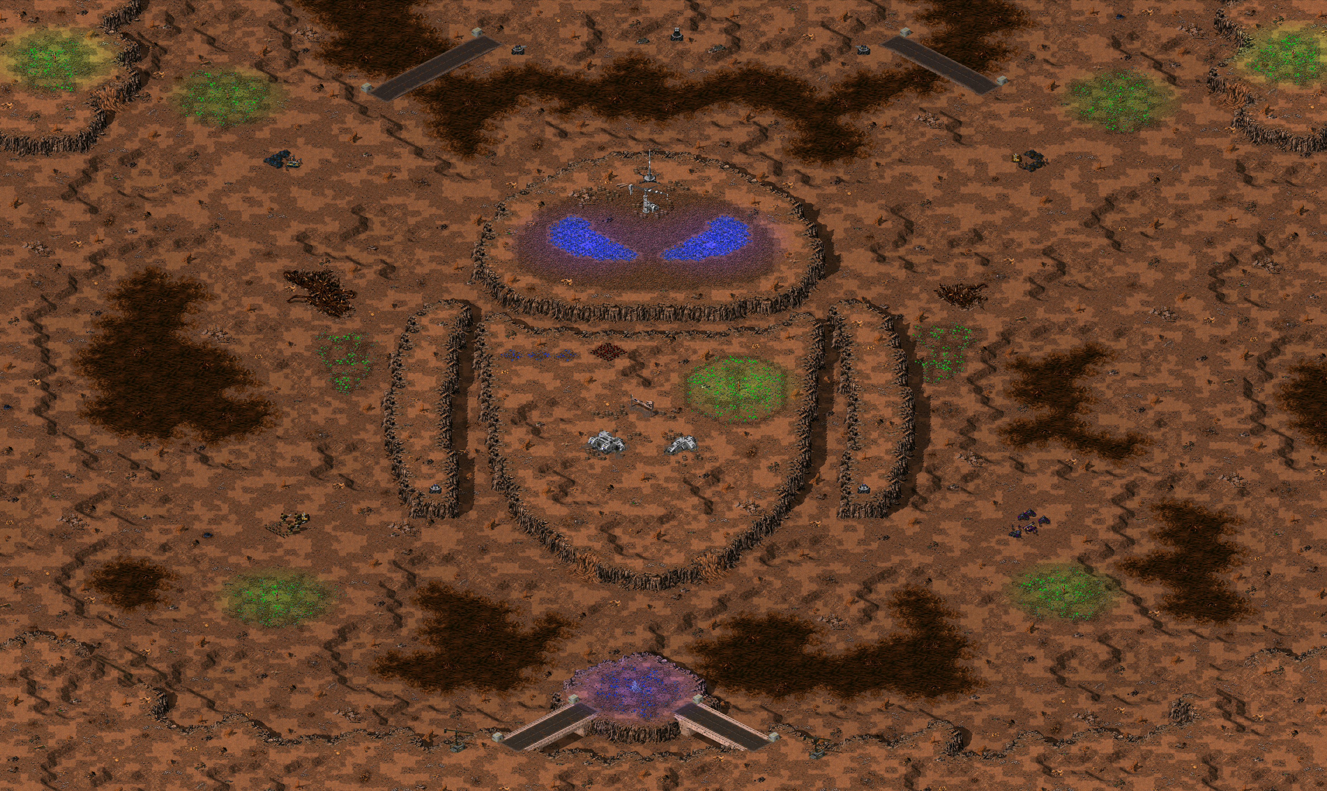
EVErgrowing Infestation: As the thorn infestation spread along with Tiberium to the Chimero area, GloboTech immediately evacuated the area and begun the cleanup operation; Something went horribly wrong though, and now there is only ruins and uninhabitable wastelands. The area is still occasionally scouted for any signs of ability to support life for possible recolonization, but the hopes are dim.
well...i like the idea of creating maps based on images such as the midnight fury...but at least the midnight furry had a little bit more complexness in it.
I suggest working with this one a lot more so it's less bland via other areas but so that the image of EVE still sticks out.
perhaps expanding it a bit and including outlining cliffs in which the players start up on and making more use out of EVE itself would be something better... _________________ Kalistia Crestland (2)
In Soviet Russia, grass grows on tiberium! QUICK_EDIT
Of course not. There is only one more joke map planned (this one wasn't), plus since TI will have easily around 150 maps by the time it's final, the joke maps will be scarce. If only there was a way I could add these as unlockable maps. QUICK_EDIT
joke maps also don't have to be completely bland either. I.G. Midnight Fury was much better than this. This which seemingly takes a similar approach just doesn't have the same ability within the joke to make it funny and decently designed enough to actually want to play it.
Honestly, if C93 knew how to import images and then trace them with correct cliffs...i'd expect something like this from him...except instead of EVE it'd be something like "PLAY CASERO 2!!!!!!!!!!! NOOWWW!!!!!" for the map picture.
add some outlining cliffs for the player start locations/to lessen the blahness of it so that it makes people shit more bricks than tiberium on grass.
honestly if it were me i'd remove the water and make the EVE the highest point of a plateau then the general area around the EVE cliff set up would be a decently large flatish area with curved edges which drops relatively quickly to the lowest height for player start locations which would be semi-separated by the first cliff height up...but that's just me... envisioning things.... _________________ Kalistia Crestland (2)
In Soviet Russia, grass grows on tiberium! QUICK_EDIT
Well that's because there's no spreader and if the field is harvested there would be nothing left to cause the glow. But now when you pointed
it out, they should glow... hmmm.
m7 wrote:
I like this map. A lot. I think the community needs more fun maps like this.
Thanks, I agree
Aro wrote:
There is only one more joke map planned (this one wasn't)
What? I did quite accurate layout plannings and you claim this wasn't planned?? Oh wait...XD
Anyways, you'll never know, you'll never know...
Ixith wrote:
well...i like the idea of creating maps based on images such as the midnight fury...but at least the midnight furry had a little bit more complexness in it.
joke maps also don't have to be completely bland either. I.G. Midnight Fury was much better than this. This which seemingly takes a similar approach just doesn't have the same ability within the joke to make it funny and decently designed enough to actually want to play it.
Honestly, if C93 knew how to import images and then trace them with correct cliffs...i'd expect something like this from him...except instead of EVE it'd be something like "PLAY CASERO 2!!!!!!!!!!! NOOWWW!!!!!" for the map picture.
Hmmm that's rather interesting opinion, as I took care to focus in making this balanced, strategical map, and not just the image, which kinda
happened with Midnight Fury. Its cliffwork is sure more complex, but so is the reference image.
Ixith wrote:
I suggest working with this one a lot more so it's less bland via other areas but so that the image of EVE still sticks out.
perhaps expanding it a bit and including outlining cliffs in which the players start up on and making more use out of EVE itself would be something better..
add some outlining cliffs for the player start locations/to lessen the blahness of it so that it makes people shit more bricks than tiberium on grass.
Ah, but sure the lack of cliffs don't equal into blandness, now does it?
I could have filled it with trees, like Midnight Fury, and everyone would be happy, but cause I filled it with trash it needs more cliffs?
But yeah, I might return to this in future, And A Hard Place -style, if Aro approves
Ixith wrote:
honestly if it were me i'd remove the water and make the EVE the highest point of a plateau then the general area around the EVE cliff set up would be a decently large flatish area with curved edges which drops relatively quickly to the lowest height for player start locations which would be semi-separated by the first cliff height up...but that's just me... envisioning things....
But the water is important in creating the earth of 2815. And heightening the map like that now would require insane amount of messing around.
Don't get me wrong, I do want the map to look as good as possible, that just is too complex change for a finished map.
Anyways, thanks for the feedback, Ixith. _________________ Check out some TF Kane's Wrath action:
Tournament 3rd place. Vs. bikeRushOwnz in tournament. Ladder wars vs. bikeRushOwnz. QUICK_EDIT
I gotta agree with Crimsonum. Yes it's nice to have fun but this ain't fun... it's just bland, the layout isn't exciting. At least try to make the in-jokes smart jokes. QUICK_EDIT
@Orac:I know they do, the thing is that I had to make vertical lines and there's only two pieces of cliffs for that in each direction, and even then
the other requires too frequent fix pieces at the top. To make it more diverse I'd had to break the shape. Don't want to do that
Well it's a very simple layout, I would've just made the EVE character a part of a properly formed map rather than making it centre stage. There's plenty of 2v2 maps and really no reason to play this one IMO, there's no real terrain between players and it focuses too much on the joke.
No offense of course, you're a talented mapper so I just think you could do better. QUICK_EDIT
Joined: 18 Jun 2005 Location: Dordrecht, the Netherlands
Posted: Thu Mar 10, 2011 10:59 am Post subject:
Imho it has a better layout and looks more playable then the other joke map (with the Dragon).
Also, some ppl need to appreciate a bit of humor in mods. Even the most serious of mods need a dose of humour once in a while... QUICK_EDIT
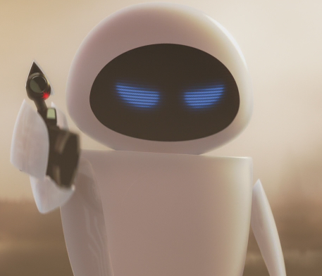
I don't find it too bland. I just think, that you could give Eve (?) a different colour, like, stick to sand in its main body (symbolizing the white body of the robot).
Just my opinion, though. And, to make it work, you will have to scrap all hills on the cliffs, which could either create balancing problems, or guys moaning around, that they are too bland (desert IS bland. Sorry man, but its this way ... )
The head of it is quite good, actually, because it really shows a contrast.
And really - its all but bland. Just the minmap looks like it. IF the body would have a higher contrast, I guess, no one would complaining _________________
Think of me as Nordos, 'cause Banshee wouldn't rename me QUICK_EDIT
Also, some ppl need to appreciate a bit of humor in mods. Even the most serious of mods need a dose of humour once in a while...
If youre refering to my posts then you need to actually read them. Absolutely nothing wrong with fun in mods, it just has to be done intelligently otherwise it's completely tacky. So many video games and films have great in-jokes and the better theyre disguised the funnier they are. QUICK_EDIT
@Rampastein: Thanks a lot man, it's always nice to hear such a detailed analysis of my work.
@OmegaBolt: Well IMHO the layout isn't any simpler than let's say, Aboreus Abyss, it's just the shape (EVE) distracting you.
I expect you to play a lot of Beta City, with some real terrain between players and 100% serious business.
And no, I'm not offended
Anyways, I was discussing it with Aro, and come to the conclusion that much can't be done anymore in terms of details, without straying away
from the maps definition. Deserts are bland-ish, like Nordos said. Sorry.
Blue glow to the eyes was added though, and the megamap is now updated. _________________ Check out some TF Kane's Wrath action:
Tournament 3rd place. Vs. bikeRushOwnz in tournament. Ladder wars vs. bikeRushOwnz. QUICK_EDIT
I would it add anyway
The more blandish won't really be noticed, 'cause its really, in my opinion, the missing contrast. And Eve(?) IS a hight tech robot, isn't she(?), therefor it wouldn't be worse then now. It would be more fitting anyway ^^
Can you just edit it, and show the minimap? Maybe I have the wrong image... But I think it would be blend well _________________
Think of me as Nordos, 'cause Banshee wouldn't rename me QUICK_EDIT
I expect you to play a lot of Beta City, with some real terrain between players and 100% serious business.
Well see you could have buried EVE into Beta City instead of making an obvious tacky "reference"... the point is theres no style in making a map centred entirely around simple EVE shaped cliffs which add no gameplay depth. I assume your actually making this map to be played on, otherwise it's entirely pointless.. might as well make it fun and have your EVE homage as well.
It's just TI meets XWIS.
I like how nobody actually reads negative posts, instead assuming that the posters "hate fun"... nobody hates fun. QUICK_EDIT
What do you mean with that?
Do you mean, cause the map is so bland? That would be a fail, since the XWIS maps are so bland, because terrain uses too much space, thus it must be deleted.
Or do you mean it in the symmetrical way? Then I have to agree, TI is missing some assymmetrical maps, IMO. It's what annoys me in SC II, too. They all have to be super uber balanced, not a single one is assymetrical nor will one be ...
On the other hand - many TI maps are symmetrical, not just this one. It's just the simplest way to balance a map xD _________________
Think of me as Nordos, 'cause Banshee wouldn't rename me QUICK_EDIT
@Rampastein: Thanks a lot man, it's always nice to hear such a detailed analysis of my work.
Well, if you want to hear more, I don't think it's bland - deserts are quite bland and not every map needs to have a superb amount of details. It looks well like a wasteland, which it's apparently meant to be.
What I was talking about was the layout (and possibly gameplay). The southern teams have only 1 route for attacking eachother, and for the northern teams I see 3. And in north-south direction the teams have only 1 wide attacking route. It's not only the amount of routes - the only tiberium fields (except for the plant symbol one) are next to the players' starting locations, meaning there's not any real fighting for tiberium (another except - if the glowing blue tiberium on the eyes spreads now). Overally the map's gameplay and tactics seem quite limited.
I've got nothing against "fun" maps however, but the "fun" stuff shouldn't be the only point of playing in a multiplayer map.
Quote:
On the other hand - many TI maps are symmetrical, not just this one. It's just the simplest way to balance a map xD
It's not really that hard to make balanced asymmetrical maps though. IMO TI needs more maps like Omicron City - a nice, asymmetrical layout with an awesome amount of details and awesome lighting (well, excluding the lag). And not every map needs to be entirely balanced anyway. Greatly unbalanced maps aren't fun, but small unbalances, like a tibfield being a few cells farther away from some player than another, don't usually harm the gameplay much. _________________ CnCNet Client | CnCNet TS patches | More Quality-of-Life Improvements for RA Remastered
Wow, what's going on in here? Time for me to step in I think.
Too many of you are taking this far too seriously, both the staff and fans. I agree on one hand that it's good to add a bit of humor into something serious somewhere (TI has a lot of hidden jokes), and on the other hand I agree that it should only be done in certain ways, but in the case of Midnight Fury and EVErgrowing Infestation, I don't see it as too much of a problem. This map seems bland due-to the shape of EVE requiring the same tile in multiple spots, which indeed doesn't look very good, but not much can be done about that as TiberianFuture is trying to stay as close to the reference as he can, plus, if anyone has watched the movie, they'd understand why the map is detailed the way that it is.
Now, I also agree with, and that there is no question about it that this map doesn't live up to the really high standards of Twisted Insurrection's serious maps and I believe in quality over quantity, but since the TI map quanitity is so huge (with quality maps), one or two maps like this doesn't hurt anybody not to mention that some people may like it and some people may not, as this thread has proven I think. It's all down to personal taste at the end of the day. I'm personally not overly fond of the map myself for all the reasons already mentioned, but I see no harm in keeping it if it goes under some more editing.
The map could do with some refining, maybe expanding the borders to add some additional cliff areas but the main thing that throws everybody off is the EVE shape and how it is made, which has already been mentioned.
Constructive feedback is always welcome, but don't take things that aren't supposed to be taken seriously so seriously.
I have spoken. Last edited by Aro on Thu Mar 10, 2011 5:14 pm; edited 1 time in total QUICK_EDIT
... the point is theres no style in making a map centred entirely around simple EVE shaped cliffs which add no gameplay depth. I assume your actually making this map to be played on, otherwise it's entirely pointless.. might as well make it fun and have your EVE homage as well.
I like how nobody actually reads negative posts, instead assuming that the posters "hate fun"... nobody hates fun.
That ^^^ ...
also...can't really use the "it's a desert!!" for it being bland which IMO has nothing to do with the details on the LAT but rather the functionality of it all, yea deserts are mostly flat and what not but they also don't have any water to get infested in... at least not in that amount...
but no cliffs dont equal into blandness completely lots of things do, outlining cliffs were just an idea i proposed as i personally think it'd look good here. The tons of trees in Midnight Fury wasn't what made that better either but rather the fact the image wasn't just this bit in the center but rather that the map WAS the image just about. Sure EVE takes up a big portion of the map...but really not that much and there's just about no reason to even use EVE except perhaps the green tib field in the lower section of EVE, which for the meaning of so called balanced gameplay...is kinda not balanced for the top players due to no ease of access into it. All in all it's more of the way that EVE plays into the functionality of the map...if there was more of it for it to do...then you wouldn't need something else to give it that extra bit to make it less bland and give it a function of actually playing it. And no the image itself doesn't always have to be the sole function of the map either...but if it's not there just needs to be something more elsewhere to give the joke a bigger punch and the map a playability.
as to Aro's new post that he posted in the midst of this typing. I think more people are taking it too seriously in the aspects of "People need a sense of humor" when referring to the people who are giving constructive criticism by refering to aspects of the map that could be better which would give the joke a lot more to it than just "oh hey look there's a map of EVE! lol...moving on...oh hey look there's a good 4 player map". The joke would be a lot better if it's put within something more playable or fulfilling. I know i'd shit bricks laughing if i suddenly realized i was playing/had played before on a map based on EVE and perhaps didn't catch it the first time because there was more to it than just EVE and 4 player start locations in a 'desert' with water spots on the edges...
i think that's all i have to say. but regardless imma end my rambling now cause i know how much you like long walls of text... _________________ Kalistia Crestland (2)
In Soviet Russia, grass grows on tiberium! QUICK_EDIT
Did you actually read my post? If you did then you'll see that I actually agree with you and Bolt. Also, nobody here said that anyone else "needs a sense of humor", I just stated that it's good to have one which was generically speaking and not aimed at anyone. When I posted the preview of this map publicly, I wasn't actually expecting people to take it this seriously as the map isn't supposed to be taken too seriously, I was just expecting things like "LoL" and nothing more. I also said that the map could do with some refining based on the comments here, and TiberianFuture has already began editing the map.
By the way, your signature gave me the first laugh of the day.
Quote:
I like how nobody actually reads negative posts
Don't group everybody together as a whole, because I think you're right. I always pay attention to negative comments if there are valid reasons behind them. QUICK_EDIT
Leave the map alone. EVE is kind of cute and needs glowing eyes. There is a ton of 'unique' asymmetrical maps in the PPM and (I think) TibWeb forums or that huge map compilation Team Black put together years ago.
Comparing this to bland XWIS maps is really insulting, though. Loosen up. Do I have to put Tiberium on grass? _________________ Victory! QUICK_EDIT
Forgive my rare posts, I'm certainly not hiding behind my words, however I only have a bit of time to browse these forums per day, not to mention posting on them.
My concern with this particular map (and Midnight Fury to lesser extent) is the theme of drawing a map with a clearly visible Dreamworks animation character on it. It's my opinion that it lowers or entirely eliminates the pseudo-realistic and grim athmosphere of TI. That doesn't mean the mod can't have some humor to light things up a bit, but are references to all-ages (I'd say children's, but I know people would misunderstand me) animation movies required? I mean, I sure liked Winnie the Pooh and Donald Duck, but I'd never make a map based on either, not for TI at least.
Last, your replies and your new...well, self-complimenting sig make me think you should take criticism more lightly, TF. _________________ QUICK_EDIT
Hmm, even if funny, one thing that pisses me off as orac said its the cliff position, i know cause of the map it needs to be there, but seeing that make me nuts.
Given that it is one map out of... how many? I don't think this will destroy TI's atmosphere. If it does, then I think the bigger question should be how a map is destroying the atmosphere of an entire mod?
Example: Metal Gear Solid has a character with, eh, irritable bowels who is recurring in every game and in the canon story.
Seriously, its a level, in a video game. Does it need to be SERIOUS BUSINESS all the time? _________________ Victory! QUICK_EDIT
Also Known As: evanb90 Joined: 20 Feb 2005 Location: o kawaii koto
Posted: Thu Mar 10, 2011 8:49 pm Post subject:
I like the map. Not every battlefield has to look crazy and more rugged than the meteor-scarred surface of Mercury. And I have to agree with Volgin, comparing this to XWIS maps, pretty rude.
Frankly the thing that bothers me is the map balance. Bottom players are basically boned, with the valuable blue tib going to the top players indefinitely. The bottom-left player even more so, with that secondary tib patch on the body of EVE going to the bottom-right. _________________ YR modder/artist, DOOM mapper, aka evanb90
Project Lead Developer, New-Star Strike (2014-)
Former Project Lead DeveloperStar Strike (2005-2012), Z-Mod (2006-2007), RA1.5 (2008-2013), The Cold War (2006-2007) QUICK_EDIT
Oh wow, there sure is some comments. Gotta make my longest post ever.
Ordosherrscher wrote:
The more blandish won't really be noticed, 'cause its really, in my opinion, the missing contrast. And Eve(?) IS a hight tech robot, isn't she(?), therefor it wouldn't be worse then now. It would be more fitting anyway ^^
Can you just edit it, and show the minimap? Maybe I have the wrong image... But I think it would be blend well
Maybe I'm just tired cause I don't get what you're saying, but yes, she's very high tech robot, and the megamap is updated but not the preview
that links to it.
OmegaBolt wrote:
Well see you could have buried EVE into Beta City instead of making an obvious tacky "reference"... the point is theres no style in making a map centred entirely around simple EVE shaped cliffs which add no gameplay depth. I assume your actually making this map to be played on, otherwise it's entirely pointless.. might as well make it fun and have your EVE homage as well.
It's just TI meets XWIS.
Alright..., yes, that was the idea (to make it playable). I'm agreeing to a degree that there's some gameplay issues. I'll enlarge the map, for the
sake of making it better.
And that last note was really unnecessary and unfitting
^Rampastein wrote:
What I was talking about was the layout (and possibly gameplay). The southern teams have only 1 route for attacking eachother, and for the northern teams I see 3. And in north-south direction the teams have only 1 wide attacking route. It's not only the amount of routes - the only tiberium fields (except for the plant symbol one) are next to the players' starting locations, meaning there's not any real fighting for tiberium (another except - if the glowing blue tiberium on the eyes spreads now). Overally the map's gameplay and tactics seem quite limited.
Thanks, now why didn't you post like that in first place instead of generally mocking the map?
I see that the map needs a little bit more size - I'll make this tactical.
Aro wrote:
Now, I also agree with, and that there is no question about it that this map doesn't live up to the really high standards of Twisted Insurrection's serious maps
I'm personally not overly fond of the map myself for all the reasons already mentioned, but I see no harm in keeping it if it goes under some more editing.
Woah. Wut? You could have said it like that straight in the MSN.
Aro wrote:
The map could do with some refining, maybe expanding the borders to add some additional cliff areas but the main thing that throws everybody off is the EVE shape and how it is made, which has already been mentioned.
Will do, boss...
Cranium wrote:
I kind of like it
Thanks
Ixith wrote:
also...can't really use the "it's a desert!!" for it being bland which IMO has nothing to do with the details on the LAT but rather the functionality of it all, yea deserts are mostly flat and what not but they also don't have any water to get infested in... at least not in that amount...
but no cliffs dont equal into blandness completely lots of things do, outlining cliffs were just an idea i proposed as i personally think it'd look good here. The tons of trees in Midnight Fury wasn't what made that better either but rather the fact the image wasn't just this bit in the center but rather that the map WAS the image just about. Sure EVE takes up a big portion of the map...but really not that much and there's just about no reason to even use EVE except perhaps the green tib field in the lower section of EVE, which for the meaning of so called balanced gameplay...is kinda not balanced for the top players due to no ease of access into it. All in all it's more of the way that EVE plays into the functionality of the map...if there was more of it for it to do...then you wouldn't need something else to give it that extra bit to make it less bland and give it a function of actually playing it. And no the image itself doesn't always have to be the sole function of the map either...but if it's not there just needs to be something more elsewhere to give the joke a bigger punch and the map a playability.
The idea was, that it is left vs right, top players expand to the head and bottom ones to the body. The 'eyes' are valuable even without regrowth.
But yeah, I expand and edit it. Stay tuned.
Aro wrote:
I was just expecting things like "LoL" and nothing more. I also said that the map could do with some refining based on the comments here, and TiberianFuture has already began editing the map.
Me too, thus the sig. Not for bragging like Crimsonum seems to think.
And true, from finished to WIP we go.
Volgin wrote:
Leave the map alone. EVE is kind of cute and needs glowing eyes. There is a ton of 'unique' asymmetrical maps in the PPM and (I think) TibWeb forums or that huge map compilation Team Black put together years ago.
Comparing this to bland XWIS maps is really insulting, though. Loosen up. Do I have to put Tiberium on grass?
Thanks for the support; she already has glowing eyes, check the full-sized image from the link
Crimsonum wrote:
My concern with this particular map (and Midnight Fury to lesser extent) is the theme of drawing a map with a clearly visible Dreamworks animation character on it. It's my opinion that it lowers or entirely eliminates the pseudo-realistic and grim athmosphere of TI.
Another woah.
Now let's get this straight: The theme of the maps is NOT on the studio but on the character itself. I made Toothless and EVE cause they're cool
and it was fun and challenging. I'm NOT advertising Dreamworks here.
Also: EVE is from Pixar, your argument is invalid from the beginning.
And I don't think it takes anything off the atmosphere, when I've been crafting the very same atmosphere to the maps itself, no matter how they
look on the preview.
Crimsonum wrote:
That doesn't mean the mod can't have some humor to light things up a bit, but are references to all-ages (I'd say children's, but I know people would misunderstand me) animation movies required? I mean, I sure liked Winnie the Pooh and Donald Duck, but I'd never make a map based on either, not for TI at least.
Last, your replies and your new...well, self-complimenting sig make me think you should take criticism more lightly, TF.
It looks like you're having some problems with the animation genre (okay it's not genre but meh). Please don't mirror that on my maps.
I guess you would jump in joy if I'd make a map looking like, let's say, Terminator or Alien, because it would be a 'right' kind of reference?
Last, I was expecting totally different comments, like the Midnight Fury received. Now the text does look a bit... ignorant. That wasn't my intention
when creating it.
Alright..., yes, that was the idea (to make it playable). I'm agreeing to a degree that there's some gameplay issues. I'll enlarge the map, for the
sake of making it better.
And that last note was really unnecessary and unfitting
Well the TI part of that was supposed to be reassuring. QUICK_EDIT
Joined: 03 Dec 2008 Location: Your Mum Dragons: Lame
Posted: Thu Mar 10, 2011 10:49 pm Post subject:
Bearing mind there are two key elements to a map:
1/. How does it look?
2/. How does it play?
The map doesn't look bad, it's just silly personally I like it and by no means is it boring, if it didn't have the robot in the middle I bet it would be praised for it's excellent design as a barren wasteland.
I haven't got my hands on it yet but I can tell this will be a great map to play on it's just asking for a good 2v2!
Good stuff TF, keep it up _________________ DIAB: Dragons are lame.
I don't get how comparing a guy's map to XWIS drivel is somehow able to be 'reassuring'. Its pretty rude.
Sigh... it was not intended to be rude, I was imply being honest.
This map, in my opinion, has a LAYOUT with similar quality to an XWIS map. Of course it has TI standards of latting and detail, just simply the layout is bland.
And as I said the TI part of that sentence was 'reassuring', not the XWIS part. QUICK_EDIT
Joined: 18 Jun 2005 Location: Dordrecht, the Netherlands
Posted: Fri Mar 11, 2011 10:21 am Post subject:
One last post from me before I drop the matter at hand.
@OmegaBolt: it wasn't directed at you, but at the ppl in generic who take some mods too serious. In essence, what Aro said. QUICK_EDIT
I'm NOT advertising Dreamworks here.
Also: EVE is from Pixar, your argument is invalid from the beginning.
1. I never said you are. 2. It's quite irrelevant what animation studio this is about, it doesn't render my argument invalid because you misunderstood it from the beginning (see part 1). Besides, I didn't bother to check even if I could.
Quote:
It looks like you're having some problems with the animation genre (okay it's not genre but meh).
Not really, I've watched both movies and they were really good animation films, but I wouldn't include that enthusiasm in TI.
Quote:
I guess you would jump in joy if I'd make a map looking like, let's say, Terminator or Alien, because it would be a 'right' kind of reference?
No, I wouldn't. Maybe I'd feel it less unpleasant about them, but I'm not a fan of either series. Well, even if I were, I'd still not make a map based on the image of the Terminator's or the Alien's face.
Quote:
Now the text does look a bit... ignorant.
How is it ignorant? I haven't read a half of the other posts here so I don't know about those, but I've stated my opinion and I have a right to that opinion. Okay, given that my first post was as lame as I felt the map is, apologies about that.
Lastly, for the anti-seriousness posts I've seen; in the end it's up to the mod leader to decide what goes too far, or on the other hand, when things are taken too seriously. Personally I feel I'm not taking things too seriously, but I dislike if there are barely any norms to respect, be it anything from style-wise to map-wise to story-wise.
But that's just my opinion. _________________ QUICK_EDIT
I guess you would jump in joy if I'd make a map looking like, let's say, Terminator or Alien, because it would be a 'right' kind of reference?
No, I wouldn't. Maybe I'd feel it less unpleasant about them, but I'm not a fan of either series. Well, even if I were, I'd still not make a map based on the image of the Terminator's or the Alien's face.
Just as a quick aside, maybe maps aren't the best way to pay homage to a genre or film/game/comic book/person/P.O.D?
I for one know that drawing inspiration from (Actually, Aliens and Terminator specifically) has yielded some really solid voxel and structural designs.
I'd keep this kind of reference for a little easter egg unit rather than a whole map. Making such an obvious reference is jarring, it was cool with Toothless but is now a little forced imo. A crate unit of EVE might be cool, or even just writing it into the campaign in a minor role. Its references like this which give texture and depth to the game in comparison to pictures on maps which are hard to take as seriously.
A Xenomorph face wouldn't be so bad though... More complexity. QUICK_EDIT
The map looks fine and is well detailed aside from the oddity that is EVE. Given that TI has a wonderful campaign and a boatload of missions, I really am floored at how people are pissing and whining about how this map will destroy the atmosphere. Why can't we have a little fun with mods? The point of a mod is to have fun and make a game fun.
Quite honestly, this is a nice change from the array of neon-colored maps that dominate the TS map forum and mods, or those infamous red zones which try to be more dramatic and devistating than the last.
This map does not have to be played. You can ignore it on the map menu. You aren't being forced to play it. Seriously people, can we lighten up? _________________ Victory! QUICK_EDIT
You cannot post new topics in this forum You cannot reply to topics in this forum You cannot edit your posts in this forum You cannot delete your posts in this forum You cannot vote in polls in this forum You cannot attach files in this forum You can download files in this forum