Also Known As: banshee_revora (Steam) Joined: 15 Aug 2002 Location: Brazil
Posted: Tue Jun 08, 2004 4:45 pm Post subject:
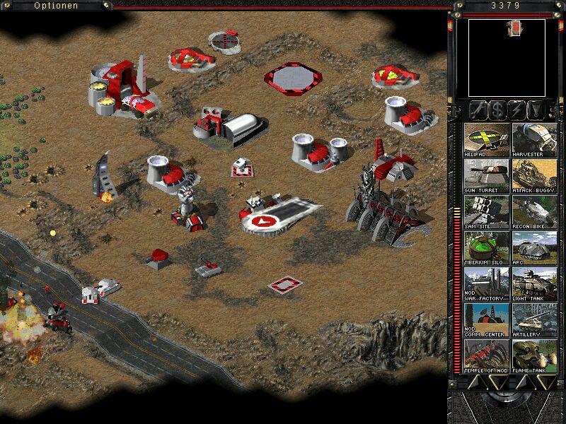
I'll wait for a better version of the refinery before posting any news about it. So far, it's interesting but it needs some work to put it in a proper size and fix some other minor graphical problems. _________________
Mods, Mods Support, Public Researchs, Map Archives, Tutorials, A Friendly Community and much more. Check it out now! QUICK_EDIT
Joined: 26 Apr 2003 Location: Somewhere in Germany
Posted: Tue Jun 08, 2004 11:20 pm Post subject:
Banshee wrote:
I'll wait for a better version of the refinery before posting any news about it. So far, it's interesting but it needs some work to put it in a proper size and fix some other minor graphical problems.
to be honest, I don't get your point at this. it fits exactly into 3x3 cells, the only issue is that the harv-unload point isn't centered, but that's something we'll look into.
and what do you mean with "other minor graphical errors"?
On the ref there's only some non-remapable, that's why i used red color , but besides that, i couldn't see any graphical problems...
or where you talking about the other buildings as well? QUICK_EDIT
Joined: 26 Apr 2003 Location: Somewhere in Germany
Posted: Tue Jun 08, 2004 11:28 pm Post subject:
Kravvitz wrote:
The barracks seems a little small.
hehe, that's what I told jokeman as well
he won't have that much time because of uni this month though, so I think it has lower priority, since making it bigger would eventually require a remake.
Kravvitz wrote:
The turret and sam site could use more detail, but I don't know what.
on sam site i don't know as well, but we'll improve the turret for sure.
Kravvitz wrote:
The conyard still looks odd to me. The fans look odd and the main section seems too long and skinny.
I think DJFreestyler and Jokeman will take care about it. QUICK_EDIT
Joined: 10 Aug 2003 Location: Laughing at Donald Trump in a rather flat place
Posted: Wed Jun 09, 2004 12:16 am Post subject:
The communications center looks nice.
BTW, have you gotten the anim. for the airstrip yet?
I love that anim... _________________ Tiberian Station
Image guy on the Dune Sun\
- Peace - Through - Wossname - QUICK_EDIT
Also Known As: banshee_revora (Steam) Joined: 15 Aug 2002 Location: Brazil
Posted: Wed Jun 09, 2004 2:30 am Post subject:
The refinery is cool, but it can be improved if:
- you raise the number of sides of the cylinders, because the current setting looks very squared.
- height was a bit smaller. It seems to be currently nearly as big as the obelisk.
Harvester is also cool, although you need to do a small work in the front.. for some reason that part is weird, but the rest of the voxel ownz.
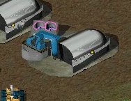
Sam is not looking good.
And finally, I loved that turret ! Great job! _________________
Mods, Mods Support, Public Researchs, Map Archives, Tutorials, A Friendly Community and much more. Check it out now! QUICK_EDIT
oh by the by nice chaos derdnaught odd walking anim tho even has the plasma cannon where did u get it?
It's completely from scratch built in 3dsmax by myself. And it's not entirely a chaos dreadnought, it's combined chaos/normal space marine dreadnought and a warlord titan.
Reaperrr wrote:
Kravvitz wrote:
The conyard still looks odd to me. The fans look odd and the main section seems too long and skinny.
I think DJFreestyler and Jokeman will take care about it.
Yep, we are. The conyard is being resized to 4x4 instead of 3x3 to make it fit better with the other buildings, and also it will be less dark. (I know some of you were commenting on that)
Oh and Kravvitz, what's wrong with the fans? They don't look so good in the screenie, but ingame they are quite good, they are animated to rotate.
There's also the production anim and the lights on the side are also animated. (Man, i just love 3dsmax )
And IMO, the main part isn't too long. It's just turned for TS perspective. If you look at the CY unfolding movie from TD you can see it's quite big.
Here's a screenie of the resized one, this time also with a damaged one:
- you raise the number of sides of the cylinders, because the current setting looks very squared.
ok... i will try this
Remember that you are rendering these models, so you can use as many polies (polygons) as you want, without worrying about them slowing the game down.
Jokeman wrote:
Banshee wrote:
Sam is not looking good.
which sam do you mean? there are two versions in the screenshot
The one with the turret up the inside and outside greys on the base are different. The one with the trret down doesn't look like its corners are square.
DJFreestyler wrote:
Reaperrr wrote:
Kravvitz wrote:
The conyard still looks odd to me. The fans look odd and the main section seems too long and skinny.
I think DJFreestyler and Jokeman will take care about it.
Oh and Kravvitz, what's wrong with the fans? They don't look so good in the screenie, but ingame they are quite good, they are animated to rotate.
There's also the production anim and the lights on the side are also animated. (Man, i just love 3dsmax )
The areas that I outlined in pink look odd. Are those supposed to be sticking out over the fans?
The areas that I outlined in pink look odd. Are those supposed to be sticking out over the fans?
Yes, they are supposed to be that way. If you look closely at the movie, you can see that its angled, rather than straight. I had a grate on top of it first, but i removed it because it screwed up the fans and didnt really add anything either. QUICK_EDIT
Joined: 26 Apr 2003 Location: Somewhere in Germany
Posted: Thu Jun 10, 2004 1:54 pm Post subject:
The DvD wrote:
The ref is based on a voxel?! Who the hell makes a voxel of a building when you can't use it anyway
me
of course I knew a voxel building can't be used directly, but I have no skills at 'real' 3D modeling, nor in Photoshop, so this was the only way for me to create the refinery. Also I did that before Jokeman appeared.
@SMIFFGIG: I think Jokeman just takes the original graphics and remakes them in Photoshop (but don't ask me how, I have ps as well and whenever I try to 'improve' a building graphic it looks even worse afterwards ) QUICK_EDIT
I would recommend using the Renegade ref model, and touch it up a bit in Photoshop or PSP or whatever. Also Reaperrr, I could still use those infantry shps if you don't mind, thanks _________________ QUICK_EDIT
Joined: 10 Aug 2003 Location: Laughing at Donald Trump in a rather flat place
Posted: Thu Jun 10, 2004 11:18 pm Post subject:
not necesarely.
IMO, if they remake the building, it's a-ok, as long it has some resemblance to the origional. _________________ Tiberian Station
Image guy on the Dune Sun\
- Peace - Through - Wossname - QUICK_EDIT
to make it only bigger is no solution because in that case, the load animation will not work
@ all:
something different...
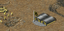
i've made a new version of the gdi barracks, which has a more TD like top...
please compare it with the versions before and tell me, what you think
The pole is diffrent (sorry for the double post pressed the quote button instead of the edit button) _________________ Please, read the signature rules of the forum. QUICK_EDIT
I think the new one looks best, including the roof texture.
@ackron the mighty:
AS i told you, i created the dreadnought myself, including the animations. It's actually a unit for a mod that i'm working on. QUICK_EDIT
You cannot post new topics in this forum You cannot reply to topics in this forum You cannot edit your posts in this forum You cannot delete your posts in this forum You cannot vote in polls in this forum You cannot attach files in this forum You can download files in this forum