Also Known As: banshee_revora (Steam) Joined: 15 Aug 2002 Location: Brazil
Posted: Tue Jan 01, 2008 3:58 am Post subject:
Attention: PPM is no longer a Blue Zone!
Subject description: Happy new year! ... with a happy new layout!
Happy new year everyone!
In 2007, PPM has returned to its old blue style. We are starting a new year, with a completely new look. This new layout made by Muldrake was inspired on Command & Conquer 3.
But this layout doesn't simply includes a new look. It also comes with some new features. The most noticeable of them is that, if you click on any menu, it expands with its options. So, the site is no longer cluttered with options. It simply shows them on demand.
And, of course, the categories were re-organized, some links updated and featured area includes new cooler icons.
I hope it is a nice start for 2008 and there will be more good things incomming, although my primary focus will be on my final project for the university (which is the reason I left Revora).
Anyway, in the name of PPM, we wish a happy 2008 for everyone. If the year of your calendar is different than 2008, we wish you a late happy new year for you as well.
Looks fine, I actually like it.. BUT I would love to see our old forum layout back.. you know back in the day _________________
ayylmao on Discord QUICK_EDIT
I like the new look. It is interesting. Though it did take a bit longer to load it up or at least it seemed to me.
Great job guys.
Though I did notice something interesting....although I am sure its an edit thing you guys are still doing. But at least in the Spotlighted maps part of the Tiberian Sun section of the main page some maps show up 2 times. I think this is because you guys are going through and adding TS or FS in front of the names of the maps if they don't already have them. BTW I did notice some new spotlights...(kinda sad Yelcraz Island and Lake Istelv didn't make the cut after the long work I put into them...but meh oh well.) _________________ Kalistia Crestland (2)
In Soviet Russia, grass grows on tiberium! QUICK_EDIT
I have to admit, I don`t really like the expandable menus. I really liked being able to simply click on Forum, and then be there. Now I have to click on Site first, and now it`s a little more inconvenient... _________________ QUICK_EDIT
I didn't drink too little yesterday, and now I'm still pretty dizzy after sleeping for 7 hours... opened this site and was like WTF!!???!!?111?ß
Oh yeah new design huh? humm time will tell whether I like it, it looks pretty good, that's for sure.
But having to open a tab on the left might be a bit annoying, might remove that feature for easier feature accessability... or something QUICK_EDIT
... when I had the design pretty much finalised in november I made sure it was xhtml compliant.. those errors are new to me, so... Banshee?
Is my html really that bad?
Ixith wrote:
I like the new look. It is interesting. Though it did take a bit longer to load it up or at least it seemed to me.
Yeah, it does take a little longer to load, but its never taken as long as is now, but the whole of PPM is running slow for me at the moment..
Ixith wrote:
Though I did notice something interesting....although I am sure its an edit thing you guys are still doing. But at least in the Spotlighted maps part of the Tiberian Sun section of the main page some maps show up 2 times. I think this is because you guys are going through and adding TS or FS in front of the names of the maps if they don't already have them. BTW I did notice some new spotlights...(kinda sad Yelcraz Island and Lake Istelv didn't make the cut after the long work I put into them...but meh oh well.)
Damn, I'll have a look at that, thanks for pointing that out.
Destiny wrote:
Very nice, Muldrake. Making any for the forums?
I'm not sure I could complete a full design for the forums, that plus nothing should be worked on the forums now, as eventually it'll move to phpbb3.
DeathRay2K wrote:
I have to admit, I don`t really like the expandable menus. I really liked being able to simply click on Forum, and then be there. Now I have to click on Site first, and now it`s a little more inconvenient...
Its something I wanted to try out, basically so.. there is potentially a lot more information easily accessible from the top of the main page, without a vast amount of scrolling being needed. The whole rearrangement of the site was to provide a more useful front page, so the major parts can be reached without scrolling.
But if people really don't like it, it can be easily removed. Or we could just have the site section already open?
Suiseiseki wrote:
..Is there a way to get the old one back? I preferred it.
Tell me what you prefer, and I could potentially work on improving it?
I appreciate that its different, and so may annoy people so I'm more than willing to try and work on it so it gets better for people.
EDIT: TSHyper, yeah.. you did. I forgot, sorry! _________________ If there is a problem on the forums, PM me. QUICK_EDIT
Equi, what you're saying is basically "Yeah, this is bad, but look at that guy, he's even worse!". That is not really something to be proud of.
Muldrake, firstly, XHTML is still only for pages which display non-standard content such as mathematical expressions (MathML) or RSS/Atom feeds, or sites run by elitist wannabes, good old HTML 4.01 Strict is still the best for most sites. However, in this case that is a moot argument, since Revora's networkbar only works with XHTML (blah). (Here's a good reference thread explaining XHTML vs HTML.)
Most of the errors in the validator are because the & in URL are supposed to be escaped like "&" , something that the validator tells you in bold letters after each error.
About your HTML semantics... W3C describes the intended purpose of each element. E. g., <p> is used to denote a paragraph of text, <ul> denotes an unordered list, etc. In an ideal world, you should only use elements for their intended purpose.
Some semantical best practices:
A list of links goes into, that's right, <ul>, <ol> or <dt> elements. Not into <p> or some other box.
<table> is only used to display actual tabular data and not to lay out the design.
<h1> - <h6> are used for headings, not <span>.
<blockquote> is the proper container for citations, not <div class="quote">.
Class names and IDs reflect the intent, not the style.
<div> and <span> are fallbacks for cases when you don't have an element dedicated to this purpose, not universal wonders that should be used everytime you can.
JavaScript enhances the site, doesn't control it (meaning, most of the stuff should work without JavaScript enabled).
Disabling CSS doesn't render the content unreadable.
As for the collapsed menus, wouldn't it be easier to make them open up as soon as you scroll over them? QUICK_EDIT
Also Known As: banshee_revora (Steam) Joined: 15 Aug 2002 Location: Brazil
Posted: Tue Jan 01, 2008 2:11 pm Post subject:
Some of the errors were inherited from the new links added on PPM's birthday (SVN ones). So, my fault.
Some others came from one of the news from RotD and a later news about PPM Plays Festival :: RotD day from Muldrake. But these are blamed to phpBB that refuses to allow you to add a /> in the end of the img tag, when you write the html code on your own.
I've fixed them all. Last edited by Banshee on Tue Jan 01, 2008 2:15 pm; edited 1 time in total QUICK_EDIT
I'm not really sure, it's just there's this quite cool layout with the sci-fi bracket things and then the banner is some text slapped over some faction icons with the tagline in a box underneath.
It's probably the image integration that's getting me, so:
I think dropping the icons might be better, keep the PPM text as it is, lose the box around the tagline,make the tagline about half it's current size and get it all on one line under the PPM text.
Maybe lose the brackets around the banner too, or make them small on each end of the tagline.
Something like attached, but aligned properly and without the bits of icon in the PPM text.
Obviously black is transparency, and you can cut the blank parts of to take a tiny bit off load time.
And news posts being centred instead of aligned left would stop them looking off balance because of the 3 column nature of the layout.
ppmban.jpg
Description:
Filesize:
58.91 KB
Viewed:
16677 Time(s)
_________________ Last edited by Daz on Tue Jan 01, 2008 3:19 pm; edited 1 time in total QUICK_EDIT
Joined: 22 Aug 2006 Location: somewhere south of the north pole
Posted: Tue Jan 01, 2008 4:30 pm Post subject:
I liked the new look, but I prefer the old one;) and the old logo is way better than the new one. Good try though:p _________________ This is a signature QUICK_EDIT
i miss the old days like last year ah those were the days
i miss the old style like one from last year
and a skin like the front page wouldn't hurt now would it if ya know what i mean eh? nudge nudge wink wink _________________ With sadness in my heart and joy in my mind QUICK_EDIT
Joined: 25 Aug 2004 Location: DAS BOOT IM DER OSTSEE
Posted: Tue Jan 01, 2008 5:27 pm Post subject:
Agreed, that'd be sexy. Select one and it turns a certain hue, and the dropdown menu attached is that hue. Also, aside from the bars, it doesn't feel Tiberium Wars-ish much. =| Put some tiberium in it maybe or add some TW GDI logos in. _________________ PPM's Reichstrollfuherer, 236th Trollenparties brigade. QUICK_EDIT
Oh yeah, I have one more criticism. It seems like the navigation takes up as much space as it used to, but there is much, much less information, due to the large images for each button, making it feel a little clunky. _________________ QUICK_EDIT
BTW, i think an actual thread indicator would be cool. which would alter the website's hue.
probably too much work though. just an idea.
Yeah, too much work. Sorry .
DeathRay2K wrote:
Oh yeah, I have one more criticism. It seems like the navigation takes up as much space as it used to, but there is much, much less information, due to the large images for each button, making it feel a little clunky.
What? The upper+lower brackets?
A slight revamp of the banner. Any improvement?
ppm_banner_preview.gif
Description:
Filesize:
25.74 KB
Viewed:
16569 Time(s)
_________________ If there is a problem on the forums, PM me. QUICK_EDIT
Well.. suggestions to what I can do with the logos? Short of removing them .
And, I had originally intended on doing a tiberium based theme to the original front page I did, however as Banshee has reminded me, the modding activities of this site covers more than just the Tiberium games. _________________ If there is a problem on the forums, PM me. QUICK_EDIT
Take the GDI and Nod logos and put them in the gap on the left of the tagline, then take the other two logos and put them in the gap on the right of the tagline.
You'll have to resize them down somewhat.
That eliminates text pasted over image syndrome. _________________ QUICK_EDIT
Joined: 22 Dec 2004 Location: Tiberium Research Center N27
Posted: Tue Jan 01, 2008 7:49 pm Post subject:
I don't think what opeing menus are... intuitive (I didn't knew they do so, untill I've read the full post by Banshee). But I like the idea... though, I still want the good ol' style back. _________________ DUNK! QUICK_EDIT
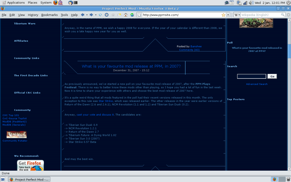
Just popped in to look at the news and was surprised at the new theme! I'm sure it's very nice but is it really meant to look like the attached? I'm using beta 2 of firefox 3 (now my primary browser) so it should display perfectly if it's valid code. I'm glad the community is holding together
still like the old one ¬_¬
how about a menu to let you choose which style to use, the new one or the old one and use the blue color scheme or this new feh...
besides i think it would look better blue _________________ With sadness in my heart and joy in my mind QUICK_EDIT
You cannot post new topics in this forum You can reply to topics in this forum You cannot edit your posts in this forum You cannot delete your posts in this forum You cannot vote in polls in this forum You cannot attach files in this forum You can download files in this forum