Project Perfect Mod Forums
:: Home :: Get Hosted :: PPM FAQ :: Forum FAQ :: Privacy Policy :: Search :: Memberlist :: Usergroups :: Register :: Profile :: Log in to check your private messages :: Log in ::


The time now is Thu Apr 18, 2024 8:18 pm
All times are UTC + 0
new website
Moderators: Global Moderators, Media Hut Moderators, Red Alert 2 Moderators, Tiberian Sun Moderators
Post new topic   Reply to topic Page 1 of 1 [9 Posts] Mark the topic unread ::  View previous topic :: View next topic
Author Message
ronco
Cyborg Firebomber


Joined: 08 Mar 2009
Location: solingen germany

PostPosted: Wed Mar 24, 2010 1:31 pm    Post subject:  new website Reply with quote  Mark this post and the followings unread

as i see that CCHyper gets useful criticism on his website ideas
and im working on a new website for my little company,
i wana know what do you think Smile


site.png
 Description:
 Filesize:  144.77 KB
 Viewed:  1903 Time(s)

site.png


_________________

Back to top
View user's profile Send private message Visit poster's website
CCHyper
Defense Minister


Joined: 07 Apr 2005

PostPosted: Wed Mar 24, 2010 1:39 pm    Post subject: Reply with quote  Mark this post and the followings unread

Very nice! Good use of colours. Though the kerning on the logo bugs me xD

Back to top
View user's profile Send private message
Deformat
Defense Minister


Joined: 17 Sep 2007

PostPosted: Wed Mar 24, 2010 3:00 pm    Post subject: Reply with quote  Mark this post and the followings unread

Everything looks brilliant.Yet you could make it a bit more "lighter" if you could move the head part more up and the lower part more down.

Back to top
View user's profile Send private message
Joshy
Schwing!


Joined: 13 Aug 2006

PostPosted: Thu Mar 25, 2010 1:54 am    Post subject: Reply with quote  Mark this post and the followings unread

Quote:
Everything looks brilliant.Yet you could make it a bit more "lighter" if you could move the head part more up and the lower part more down.


I think Ronco wants constructive criticism, not faggotbabble.

_________________
Please, read the signature rules of the forum.

Back to top
View user's profile Send private message
ronco
Cyborg Firebomber


Joined: 08 Mar 2009
Location: solingen germany

PostPosted: Thu Mar 25, 2010 11:08 am    Post subject: Reply with quote  Mark this post and the followings unread

Quote:
Though the kerning on the logo bugs me xD

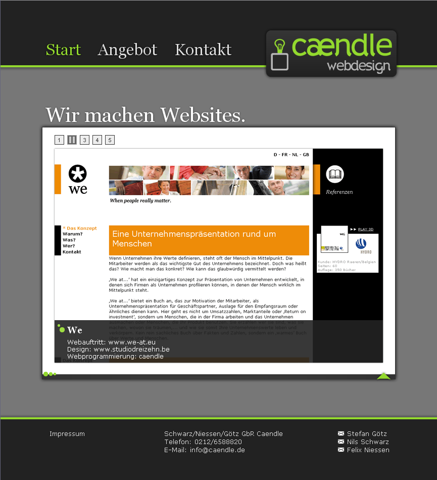
you mean that "æ" its no kerning its a letter #Tongue and i dont made that logo .. so i wont change it.

Quote:

Quote:

Everything looks brilliant.Yet you could make it a bit more "lighter" if you could move the head part more up and the lower part more down.

I think Ronco wants constructive criticism, not faggotbabble.


no its ok .. i think if its on a screen it has space to the laft and right so it looks "lighter" then it does on that image.

_________________

Back to top
View user's profile Send private message Visit poster's website
Aro
Alcohol Fueled


Joined: 10 Sep 2006

PostPosted: Thu Mar 25, 2010 11:12 am    Post subject: Reply with quote  Mark this post and the followings unread

Excellent. Very professional work.

Back to top
View user's profile Send private message
Deformat
Defense Minister


Joined: 17 Sep 2007

PostPosted: Thu Mar 25, 2010 3:47 pm    Post subject: Reply with quote  Mark this post and the followings unread

Joshy wrote:
Quote:
Everything looks brilliant.Yet you could make it a bit more "lighter" if you could move the head part more up and the lower part more down.


I think Ronco wants constructive criticism, not faggotbabble.


I meant something like this:


Back to top
View user's profile Send private message
Shadow Hunter
Cyborg Commando


Joined: 30 Aug 2008
Location: Brazil.

PostPosted: Fri Mar 26, 2010 5:00 am    Post subject: Reply with quote  Mark this post and the followings unread

Deformat....whats the difference between the two images? \_(o_O)_/ #Tongue

Back to top
View user's profile Send private message
Morpher
General


Joined: 28 Jan 2005

PostPosted: Fri Mar 26, 2010 5:09 am    Post subject: Reply with quote  Mark this post and the followings unread

It's better, the logo and top part as he said, was moved up and the bottom part moved down. Looks better considering it's, uh what was the word? Faggotbabble or something.

_________________


Back to top
View user's profile Send private message
Display posts from previous:   
Post new topic   Reply to topic Page 1 of 1 [9 Posts] Mark the topic unread ::  View previous topic :: View next topic
 
Share on TwitterShare on FacebookShare on Google+Share on DiggShare on RedditShare on PInterestShare on Del.icio.usShare on Stumble Upon
You cannot post new topics in this forum
You cannot reply to topics in this forum
You cannot edit your posts in this forum
You cannot delete your posts in this forum
You cannot vote in polls in this forum
You cannot attach files in this forum
You can download files in this forum


Powered by phpBB © phpBB Group

[ Time: 0.1565s ][ Queries: 14 (0.0102s) ][ Debug on ]