Posted: Mon Feb 27, 2012 8:40 pm Post subject:
Mental Omega 3.0 - first 2012 update!
It's true that we're already two months into 2012 and there's been no update yet. We've had a slow start but now we're back to maximum activity, working on the first release of Mental Omega 3.0.
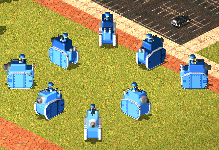
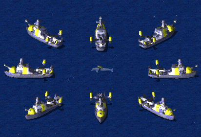
Today, we have several new units to show you, new logo for version 3.0 created by CCHyper (thanks!) and ep. 2 of Hero Spotlight!
This time we'll quickly introduce, or rather reintroduce you to two veteran heroes and a new female commando for PsiCorps.
Azri_Apoc has created several new units during last weeks. Here are some of them:
You can see the rest of new units on our website, which has also been updated. _________________ mentalomega.com QUICK_EDIT
Man, Azri's Yuri voxels are terrible. There's a complete lack of depth and they look almost flat in every direction, but the perception of the flatness is different per facing. The details of the Soviet and Allied units pictured lose all details and turn into smudgy messes in their NE/SW facings as well. QUICK_EDIT
Well at least he doesn't fully rely on just Auto Normals... at least I hope not. And they're plenty better then what I'm cooking up whenever I make voxels. _________________ ~ Excelsior ~ QUICK_EDIT
I have to agree with m7 the voxels look very pixellated, I expected more TBH.
Also your like ''almost perfect yuri's revenge'' is not correct anymore since you have hugely deviated from Yuri's Revenge and started adding far too many new sides. QUICK_EDIT
Well The Yuri voxel are quite well made (Although Some voxels in MO looks tade small IMO)But any ways dosn't matter The idea and shape are execenlt and that what made them speical.
Edit: And they look a bit pixeld because of the Vpl I think.. Last edited by Bu7loos on Tue Feb 28, 2012 1:43 pm; edited 2 times in total QUICK_EDIT
I think you don't know what terrible means m7, but hey, that's your opinion. I disagree.
What he means is this:
Take the Soviet voxel you have in the preview on this post.
Look at the star at the SE corner. See the star? It's clipping. Whilst it's not as awful as at TX1138's Rhino remake, it's still sensible.
However, it is a easy fix, all he has to do is edit the layers behind the star so that the star shows off better in those angles.
Same issue applies with other details.
Take into consideration these ideas, if you will, but then, Azri's voxels look really neat. QUICK_EDIT
Joined: 22 Nov 2010 Location: Iszkaszentgyorgy, Hungary
Posted: Tue Feb 28, 2012 2:23 pm Post subject:
DaRTzO wrote:
Also your like ''almost perfect yuri's revenge'' is not correct anymore since you have hugely deviated from Yuri's Revenge and started adding far too many new sides.
There are no new sides. As far as I know, there is still only three, Allies, Soviets and Yuri. _________________ "If you didn't get angry and mad and frustrated, that means you don't care about the end result, and are doing something wrong." - Greg Kroah-Hartman
=======================
Past C&C projects: Attacque Supérior (2010-2019); Valiant Shades (2019-2021)
=======================
WeiDU mods: Random Graion Tweaks | Graion's Soundsets
Maintainance: Extra Expanded Enhanced Encounters! | BGEESpawn
Contributions: EE Fixpack | Enhanced Edition Trilogy | DSotSC (Trilogy) | UB_IWD | SotSC & a lot more... QUICK_EDIT
I think the voxels look really good but the rendering engine for voxels in these games is not so good because there is no supersampling so things can look very noisy if there is too much detail. This wouldn't be a problem if they could somehow be converted to SHP files which can use virtually unlimited supersampling while being rendered in another program. QUICK_EDIT
@vipr, they can be made as shp's now with Banshees new vxlseIII program. He's enabled it to save vxl's as .obj, not sure if he ever tweaked the texturing and shading or what not, but they come out looking o.k. _________________
The enemy shall be injected with toxic poison - Venom QUICK_EDIT
Joined: 22 Nov 2010 Location: Iszkaszentgyorgy, Hungary
Posted: Tue Feb 28, 2012 8:51 pm Post subject:
SHPs can't support slopes. Advising them for tanks is just plain stupid, IMO.
Actually the rendering can be tweaked with VPL editing, but Speed doesn't plan to do it and IMO this style is already awesome as it is. _________________ "If you didn't get angry and mad and frustrated, that means you don't care about the end result, and are doing something wrong." - Greg Kroah-Hartman
=======================
Past C&C projects: Attacque Supérior (2010-2019); Valiant Shades (2019-2021)
=======================
WeiDU mods: Random Graion Tweaks | Graion's Soundsets
Maintainance: Extra Expanded Enhanced Encounters! | BGEESpawn
Contributions: EE Fixpack | Enhanced Edition Trilogy | DSotSC (Trilogy) | UB_IWD | SotSC & a lot more... QUICK_EDIT
AlexB explained that SHP have terrible performance.
I have also noticed this myself.
Quote:
Man, Azri's Yuri voxels are terrible. There's a complete lack of depth and they look almost flat in every direction, but the perception of the flatness is different per facing. The details of the Soviet and Allied units pictured lose all details and turn into smudgy messes in their NE/SW facings as well.
There are almost no voxels that look good in NE/SW. The engine is ztyping them up. _________________ "I'll be staying strapped cuse my mac-eleven make my nuts bigger" QUICK_EDIT
SHPs can't support slopes. Advising them for tanks is just plain stupid, IMO.
Indeed, and is why most of my tank shp's have been converted to vxl. Not only do they have issues they look like ass going up slopes. they may look awsome but thats about all thier good for.
Anyways, looking forward to playing 3.0, not sure when I will but it will be soon. _________________
The enemy shall be injected with toxic poison - Venom QUICK_EDIT
Well at least he doesn't fully rely on just Auto Normals... at least I hope not. And they're plenty better then what I'm cooking up whenever I make voxels.
i have to admit that all the normals aren't 100% handmade, and yes i'm still relying on using autonormals but with some touch-ups, i already tried few times but unfortunately it doesn't look as good as using autonormals i really hope that i can perform a handmade normals in future...
m7 wrote:
Man, Azri's Yuri voxels are terrible. There's a complete lack of depth and they look almost flat in every direction, but the perception of the flatness is different per facing. The details of the Soviet and Allied units pictured lose all details and turn into smudgy messes in their NE/SW facings as well.
seriously i don't really care what this guy thinks about my stuff, and i wouldn't count his comment as 'constructive' since there's a word of 'terrible', unless he can do better than what i can do, cuz 'some' people here just only know to complaining but so and a no go for making their own stuff, and always ended up with some cheap plug n' play modification on public assets, and this type of attitude will kill the community...
stop being lazy and mind your own business...
Deformat wrote:
Speeder wrote:
I think you don't know what terrible means m7, but hey, that's your opinion. I disagree.
What he means is this:
Take the Soviet voxel you have in the preview on this post.
Look at the star at the SE corner. See the star? It's clipping. Whilst it's not as awful as at TX1138's Rhino remake, it's still sensible.
However, it is a easy fix, all he has to do is edit the layers behind the star so that the star shows off better in those angles.
Same issue applies with other details.
Take into consideration these ideas, if you will, but then, Azri's voxels look really neat.
thanks for the advice mate, i'll see what i can do with those normals issue, and BTW this is what we called a 'constructive' criticism... _________________ Please, read the signature rules of the forum. QUICK_EDIT
I've always liked your vxl's. very well done Azri. Sometimes the autonormals screws with them, but they are still very well made vxl's regardless. _________________
The enemy shall be injected with toxic poison - Venom QUICK_EDIT
seriously i don't really care what this guy thinks about my stuff, and i wouldn't count his comment as 'constructive' since there's a word of 'terrible', unless he can do better than what i can do, cuz 'some' people here just only know to complaining but so and a no go for making their own stuff, and always ended up with some cheap plug n' play modification on public assets, and this type of attitude will kill the community..
Seriously, stop being a whiny bitch. I followed my "terrible" post with what was wrong with them. I'm sorry your elitist attitude has prevented you from seeing such. I left my opinion, followed by what lead them to believe this. If you can't take constructive criticism because it's negative, then ztype you and your assets too. QUICK_EDIT
Joined: 22 Nov 2010 Location: Iszkaszentgyorgy, Hungary
Posted: Thu Mar 01, 2012 2:13 pm Post subject:
But they are not flat, they are just smooth as the rest of the other voxels, FYI. It's just a matter of the Yuri gradient that it's not as visible.
I thought you already worked enough with the palettes to know this. _________________ "If you didn't get angry and mad and frustrated, that means you don't care about the end result, and are doing something wrong." - Greg Kroah-Hartman
=======================
Past C&C projects: Attacque Supérior (2010-2019); Valiant Shades (2019-2021)
=======================
WeiDU mods: Random Graion Tweaks | Graion's Soundsets
Maintainance: Extra Expanded Enhanced Encounters! | BGEESpawn
Contributions: EE Fixpack | Enhanced Edition Trilogy | DSotSC (Trilogy) | UB_IWD | SotSC & a lot more... QUICK_EDIT
Okay the matter with voxels is fairly simple, you should NOT ever paint any 1 pixel sized details, use at minimal two pixel wide/tall for any detailing since voxel surfaces are always being blended to some degree and this means some detail loss and then the few bits of 1 pixel like details show up separated making it dotty/blur as half blended. And main key is, bright colors are NO-NO on large surfaces as no matter what, bright colors cause blurring and actual dark shades actually achieve contrast on large surfaces and as such, any details should use lighter shades than the majority of hull and hull be using darkest shades for most optimal results.
Oh, forgot to say, unless VPL is fixed up on Yuri colors, it will always look more messy in the sides too. QUICK_EDIT
Wait, what the ztype, is this gang up on m7 because we're all too busy trying to inflate an over-inflated ego? An opinion is an opinion, but if we want to all attack me because I posted mine then I'll deal with you one at a time.
@Graion:
Quote:
But they are not flat, they are just smooth as the rest of the other voxels, FYI. It's just a matter of the Yuri gradient that it's not as visible.
Then the voxel artist should be compensating for this, not making VV porn and ingame goatse. Seriously, if a limitation with the gradient is known you don't work with it you work against it and achieve a greater level of visual quality.
Quote:
I thought you already worked enough with the palettes to know this.
I have worked enough with the palettes to know this. But I've seen plenty of Yuri voxels that do NOT lose their depth and detail on the NE/SW angles. Plenty that do too, to be fair.
@Atomic:
Quote:
Same outcome even with basic palettes put on the voxels to be honest...
Except your pics show that the voxels can look just fine at NE/SW. The rendering might not be as sharp and crisp, but there isn't a loss of perception or detail, especially with the voxels you used. Did you try to prove my point or something?
@everyone else:
Quote:
Okay the matter with voxels is fairly simple, you should NOT ever paint any 1 pixel sized details, use at minimal two pixel wide/tall for any detailing since voxel surfaces are always being blended to some degree and this means some detail loss and then the few bits of 1 pixel like details show up separated making it dotty/blur as half blended. And main key is, bright colors are NO-NO on large surfaces as no matter what, bright colors cause blurring and actual dark shades actually achieve contrast on large surfaces and as such, any details should use lighter shades than the majority of hull and hull be using darkest shades for most optimal results.
This advice should be listened to. This is exactly what has been known to be wrong with voxels from the start of modding.
I'm sorry I don't believe in promoting bad work, or sub-par work. For someone who believes himself to be so high and mighty, he sure didn't meet the expectations that should be held for the way he behaves. And not all of his voxels are bad, there are plenty of other MO voxels that look great but these just suck for the reasons I stated in the above post. Now, I completely didn't bother to address Azri, so I'll stop now and do that.
Quote:
seriously i don't really care what this guy thinks about my stuff
Because I don't just bow to your '1337 v0x3l sk1llz' you're going to ignore the feedback I posted.
Quote:
and i wouldn't count his comment as 'constructive' since there's a word of 'terrible',
One word is enough to invalidate a post? Fair to note, I'll keep it in mind.
Quote:
unless he can do better than what i can do,
Ooh, the old graphical artist "do better than me then talk" argument I see pop up every time someone who thinks they have an ounce of talent gets criticized. Old as the internet, weak defense.
Quote:
cuz 'some' people here just only know to complaining but so and a no go for making their own stuff
'Some' people on here spend more time helping others' improve their assets through constructive criticism. Oh wait, I used one bad word so my constructive criticism (that was oddly acknowledged by two other posters) is meaningless. I forgot, my bad.
Quote:
and always ended up with some cheap plug n' play modification on public assets
I hope this wasn't a shot at my mod, considering I put extensive work (and several other mods that use public assets also put extensive work into making them work for their projects) and effort to make sure the feel of the project was more than just plug and play. But, feel free to keep bashing on people who use your work and modify it, since I know this wouldn't be the first time you've openly flamed people for creative use of public assets (iamn00b, bu7loos) in their projects.
Quote:
and this type of attitude will kill the community...
The type of attitude that "you can't use my artwork and modify it if I don't like it because I think it's ugly with no real valid points to help" that you seem to spout on ModDB? Or my short opinion, followed by semi-detailed explanations of what criticisms I had leading to my opinion?
Quote:
stop being lazy and mind your own business...
I took the time to post this comment, and it was posted in a public forum. If you don't want criticism from anything but people who want to praise you overly much for above average voxels, then leave it to ModDB/MO's page.
Quote:
The two Yuri voxels, not so much. Look at the right one facing SW, there's indeed no depth as M7 claimed.
Oh look, someone agreed with me but I don't seem to see a forum going after his opinion. Maybe because...idk, my bff Jill?
To be totally honest, I removed all of Azri_Apoc's work from my mod after seeing and hearing about his total elitist attitude towards other modders. He went on ModDB and attacked two community members over them using his voxels in ways he didn't like. Not that they were in any violation of any rules, or claiming they created it, but just because he didn't like it. After the second incident, Azri removed his second voxel pack from PPM as 'retaliation' I can only suppose. However, me expressing my opinion in an honest manner is killing the community. QUICK_EDIT
I like the Battlefortress, but I'm going to agree with m7 on the other ones shown here. The Yuri ones especially wouldn't be hard to make look better, just by using the full palette a bit more effectively. For instance (constructive criticism alert!) make some use of the Soviet part of the pallete to bring out highlights more. It's not very noticeable in VXLSE, but it is noticeable ingame. Very noticible indeed.
TBH, I don't really like the use-only-a-single-gradient approach to colouring Yuri voxels. If you are to even glance at the WW ones, you'll see that they use the Soviet gradient an awful lot more. Even if you're not trying to match WW's Yuri, mixing the two gradients looks a lot better - I'd suggest using Soviet colours for the highlights and Yuri colours for the shadows, but that's just me.
I'm not sure what's wrong with the Big Soviet Thingie there. It might just be bad normals, but it looks like an inflatable. That can be fixed by tweaking the autonormal options to provide higher contrast, hand painting the normals (nobody wants to do that), or by tweaking the colours to compensate.
I'm pretty certain you're capable of this... I've got your voxel packs sitting around on my comp somewhere.
Cool video, btw! And a good logo there too. QUICK_EDIT
Joined: 23 Apr 2010 Location: indonesia, sticking at keyboard
Posted: Fri Mar 02, 2012 1:36 am Post subject:
Well, art is the matter of personal taste, artist make things, people give opinion. All voxel have been tried ingame with MO team and all team member approve it and like it with its own taste. If you don't like Mentalmeisters approach, there is always ol' MO APYR 2.0psi to grab and play (and even 1.2 :p ) _________________ QUICK_EDIT
To be honest, I'm not sure really, I'm still an amateur at Voxelling. Although Azri does have a bit of elitism to him now and then but that's just how he is.
When I make voxels its a hit and miss (i.e: the Hydrofoil) never thought it'd turn out okay... And the problem with large voxels is that normalising them is way harder than smaller ones. Even more so when adding extra tiny details which tend to wash out the quality. One of the few reasons I sometimes prefer to use less details. But meh, otherwise MO is still going to take forever to get released though. _________________ ~ Excelsior ~ QUICK_EDIT
What is this curse with every talented, productive member eventually developing an arrogant (elitist if you will) nature? I don't think my fingers are enough to count the victims...
Elitism is the belief or attitude that some individuals, who form an elite — a select group of people with intellect, wealth, specialized training or experience, or other distinctive attributes — are those whose views on a matter are to be taken the most seriously or carry the most weight; whose views and/or actions are most likely to be constructive to society as a whole; or whose extraordinary skills, abilities or wisdom render them especially fit to govern.
Btw, I really like the way how Libra can throw vehicles upside down. I only wish the effect was faster, it looks so...stiff and unnatural right now. _________________ QUICK_EDIT
Btw, I really like the way how Libra can throw vehicles upside down. I only wish the effect was faster, it looks so...stiff and unnatural right now.
That bit of animations is what sorta got my brain whirring for a new unit too. If I recall its just DirectRocker with splash damage. _________________ ~ Excelsior ~ QUICK_EDIT
Joined: 22 Nov 2010 Location: Iszkaszentgyorgy, Hungary
Posted: Fri Mar 02, 2012 10:07 am Post subject:
Let me rephrase: It's not DirectRocker.
To m7 and Orac and the rest... mixing Yuri and Soviet colors is IMO a bad thing, and it's already a huge WW backfire that the YR VPL just encourages that. And why?
Because it just turns the voxels into Spartan madness if you try to redo the gradients. To fully utilize VPLs, the Palette tag and such expandability for your mod.
Yes, this is Bu7loos's Lasher. And I didn't touched a single voxel in that. I only played with the palettes. And most voxels are fine. It's just old 3D-modeled or Soviet-Yuri mixed wannabe-Yuri voxels which turns into a big mess if I try to put those in.
No Azri voxels would go bad in this system, but your mix Soviet and Yuri ones yes. In fact, back at the time of gradient testing, I used Orac's Mastermind voxel as the test, and I went haywire that it had palette issues. Especially that after a 5th try, I noticed it had Soviet colors and the issue is wasn't in my gradient. _________________ "If you didn't get angry and mad and frustrated, that means you don't care about the end result, and are doing something wrong." - Greg Kroah-Hartman
=======================
Past C&C projects: Attacque Supérior (2010-2019); Valiant Shades (2019-2021)
=======================
WeiDU mods: Random Graion Tweaks | Graion's Soundsets
Maintainance: Extra Expanded Enhanced Encounters! | BGEESpawn
Contributions: EE Fixpack | Enhanced Edition Trilogy | DSotSC (Trilogy) | UB_IWD | SotSC & a lot more... QUICK_EDIT
But if you don't use some soviet colours, which add a subtle lightness, you end up with a coppery mess.
You're going based on an intention of repeatedly editing a voxel for a long time after initial creation, which isn't necessary. Once the voxel has been created and completed, there's no issue about which palettes are used since it will only ever be seen ingame.
If you're not going to use some soviet colours, then at the very least use some of the lighter yuri ones. It's foolish to leave them so dark and formless. Some highlights would actually give some impression of shape. QUICK_EDIT
Joined: 22 Nov 2010 Location: Iszkaszentgyorgy, Hungary
Posted: Fri Mar 02, 2012 10:24 am Post subject:
If you don't get me, then say no. What I tried to point out that if you replace the gradients in the palette (which I did), your mix-Soviet-and-Yuri colors end up with a complete mess.
I have replaced the Allied, Soviet, Yuri gradients and added in new ones to the two unused ones' places.
Why am I using dark colors... actually due to my VPL uses only colors from it's own gradient to not end up terrible miscolorations I can only have 16 own colors per gradient + greyscale which I try to decrease it's use as possible (that's why all schemes mimic Gangster's Allied TS VPL scheme, it does this) along with negative ExtraUnitLight values.
EDIT: Ah, and in case of this voxel being too dark... now I got you. Complain at Bu7loos, all of his Yuri voxels use colors on the dark range... and I haven't decided yet if I lighten those. _________________ "If you didn't get angry and mad and frustrated, that means you don't care about the end result, and are doing something wrong." - Greg Kroah-Hartman
=======================
Past C&C projects: Attacque Supérior (2010-2019); Valiant Shades (2019-2021)
=======================
WeiDU mods: Random Graion Tweaks | Graion's Soundsets
Maintainance: Extra Expanded Enhanced Encounters! | BGEESpawn
Contributions: EE Fixpack | Enhanced Edition Trilogy | DSotSC (Trilogy) | UB_IWD | SotSC & a lot more... QUICK_EDIT
@Azri_Apoc: Btw do you 3D ? , Would love to see what can you cook for MO.
yes, i have 3dsmax on my PC but i rarely use it ATM...
m7 wrote:
I'm sorry I don't believe in promoting bad work, or sub-par work. For someone who believes himself to be so high and mighty, he sure didn't meet the expectations that should be held for the way he behaves. And not all of his voxels are bad, there are plenty of other MO voxels that look great but these just suck for the reasons I stated in the above post. Now, I completely didn't bother to address Azri, so I'll stop now and do that.
enough of this bullshit talks of yours, you're the one went berserk back there, i'm not an elitist or whatever just like ya'll think, just because i didn't release anything for such a long time so i was counted as elitist? or because i've used to assault Bu7loos for editing my voxels without notifying me first also counted as elitist attitude?, OK then maybe it's my bad attitude there just because i don't like how people treat to my assets i'm sorry, but i will say here I'm not proud or feeling high at all with my works, cuz every single day & hour of my modding i'll always try to be much better and analyzing my weaknesses, but sadly people always mistaken for averything i've done...
m7 wrote:
Because I don't just bow to your '1337 v0x3l sk1llz' you're going to ignore the feedback I posted.
nobody is bowing to anybody, bowing nobody....
m7 wrote:
One word is enough to invalidate a post? Fair to note, I'll keep it in mind.
good then, this means your brain is still functioning at least...
m7 wrote:
Ooh, the old graphical artist "do better than me then talk" argument I see pop up every time someone who thinks they have an ounce of talent gets criticized. Old as the internet, weak defense.
i didn't say that i'm better than yourself, cuz i know my limits...
m7 wrote:
'Some' people on here spend more time helping others' improve their assets through constructive criticism. Oh wait, I used one bad word so my constructive criticism (that was oddly acknowledged by two other posters) is meaningless. I forgot, my bad.
by nagging them to death, i don't think this would help only making thing worse than ever...
m7 wrote:
I hope this wasn't a shot at my mod, considering I put extensive work (and several other mods that use public assets also put extensive work into making them work for their projects) and effort to make sure the feel of the project was more than just plug and play. But, feel free to keep bashing on people who use your work and modify it, since I know this wouldn't be the first time you've openly flamed people for creative use of public assets (iamn00b, bu7loos) in their projects
don't get me wrong but i didn't mention any mods here, your mod is not bad at all, for your information iamn00b and bu7loos we're cool now, as far as i see it's only you're the one who really against the world now...
m7 wrote:
The type of attitude that "you can't use my artwork and modify it if I don't like it because I think it's ugly with no real valid points to help" that you seem to spout on ModDB? Or my short opinion, followed by semi-detailed explanations of what criticisms I had leading to my opinion?
enjoy your smart mouthing while you still can, as for me past is the past....
m7 wrote:
I took the time to post this comment, and it was posted in a public forum. If you don't want criticism from anything but people who want to praise you overly much for above average voxels, then leave it to ModDB/MO's page.
who'd asking you to praise my work if you're don't like our new progress, why bother posting on MO thread, as speeder said above there's always 2.0 if you want...
PS: i'm not a praise hunger, comment sincerely don't be hypocrite...
m7 wrote:
To be totally honest, I removed all of Azri_Apoc's work from my mod after seeing and hearing about his total elitist attitude towards other modders. He went on ModDB and attacked two community members over them using his voxels in ways he didn't like. Not that they were in any violation of any rules, or claiming they created it, but just because he didn't like it. After the second incident, Azri removed his second voxel pack from PPM as 'retaliation' I can only suppose. However, me expressing my opinion in an honest manner is killing the community.[/b]
good then maybe you'll get rid your laziness habit by doing your own stuff...
and again i would like to apologize for those any people that i've insulted back a while ago, it's my bad attitude...
and secondly those packs was deleted by me cuz' i'm pretty sure everyone will know where to get it since it's not only availabe at PPM and it was quite outdated a bit, TBH i was plan to release another pack for replacements but looking at these kind situation happened here these few months i don't think there's a point for releasing another packs...
enough of this childish arguing, if these guy starts again i guess it's time for locking this topic... _________________ Please, read the signature rules of the forum. QUICK_EDIT
OHHHHHHHHHHHHHHHHHH, I wonder how Modder is gonna take all of that...!? _________________ Please, I DON'T read the signature rules of the forum. QUICK_EDIT
You're so forgiving Dutchy. A mod or news announcement is a flare that attracts trolls and flame wars.
Of course M7 wasn't trying to cause an argument and his point is entirely valid. I just don't particularly see what's bad about them. Azri has his own style which is very different to say... Project Phantom voxels. I don't think every voxeller should take the same approach and infact engine limitations can be used to give units a lovely quaint quality. IMO all these units are as good as each other, which is perfect, and completely suit the new Mental Omega. QUICK_EDIT
At first I thought m7 was trolling. Azris voxels haven't the absolute best quality, but they are not terrible like you described.
This is the definition of a "terrible" voxel imo:
_________________ "I'll be staying strapped cuse my mac-eleven make my nuts bigger" QUICK_EDIT
Also Known As: evanb90 Joined: 20 Feb 2005 Location: o kawaii koto
Posted: Sun Mar 04, 2012 1:23 am Post subject:
OmegaBolt wrote:
You're so forgiving Dutchy. A mod or news announcement is a flare that attracts trolls and flame wars.
Depending on author the entire thing might be completely ignored by the community. Ahem.
I personally don't see much of a problem with these voxels. Probably because I'm a pretty awful artist myself (so bad that 99% of this community can't even bring themselves to posting on content I make apparently) and have no concept of quality.
But I think we may want to ask ourselves- how high has the bar been set? Is it reasonable? _________________ YR modder/artist, DOOM mapper, aka evanb90
Project Lead Developer, New-Star Strike (2014-)
Former Project Lead DeveloperStar Strike (2005-2012), Z-Mod (2006-2007), RA1.5 (2008-2013), The Cold War (2006-2007) QUICK_EDIT
You cannot post new topics in this forum You can reply to topics in this forum You cannot edit your posts in this forum You cannot delete your posts in this forum You cannot vote in polls in this forum You cannot attach files in this forum You can download files in this forum